
『Plotly實戰(zhàn)指南』--布局進階篇
在數(shù)據(jù)可視化領域,Plotly的子圖布局是打造專業(yè)級儀表盤的核心武器。
當面對多維數(shù)據(jù)集時,合理的子圖布局能顯著提升多數(shù)據(jù)關聯(lián)分析效率,讓數(shù)據(jù)的呈現(xiàn)更加直觀和美觀。
本文將深入探討Plotly中子圖布局技巧,并結合代碼實現(xiàn)與實際場景案例,介紹多子圖組織方法的技巧。
多子圖布局
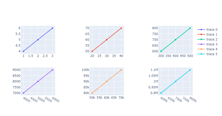
網(wǎng)格布局
網(wǎng)格布局是Plotly中實現(xiàn)多子圖排列的一種常見方式,通過make_subplots函數(shù),我們可以輕松創(chuàng)建行列對齊的子圖。
例如,設置rows=2, cols=3,就可以生成一個2行3列的子圖網(wǎng)格,這種方式的好處是子圖的尺寸會自動分配,
而且我們還可以通過horizontal_spacing和vertical_spacing參數(shù)來調整子圖之間的水平和垂直間距,從而讓整個布局更加緊湊和美觀。
from plotly.subplots import make_subplots
import plotly.graph_objects as go

fig = make_subplots(rows=2, cols=3, horizontal_spacing=0.2, vertical_spacing=0.2)

fig.add_trace(go.Scatter(x=[1, 2, 3], y=[4, 5, 6]), row=1, col=1)
fig.add_trace(go.Scatter(x=[20, 30, 40], y=[50, 60, 70]), row=1, col=2)
fig.add_trace(go.Scatter(x=[300, 400, 500], y=[600, 700, 800]), row=1, col=3)
fig.add_trace(go.Scatter(x=[4000, 5000, 6000], y=[7000, 8000, 9000]), row=2, col=1)
fig.add_trace(
    go.Scatter(x=[50000, 60000, 70000], y=[80000, 90000, 100000]), row=2, col=2
)
fig.add_trace(
    go.Scatter(x=[600000, 700000, 800000], y=[900000, 1000000, 1100000]), row=2, col=3
)

fig.show()
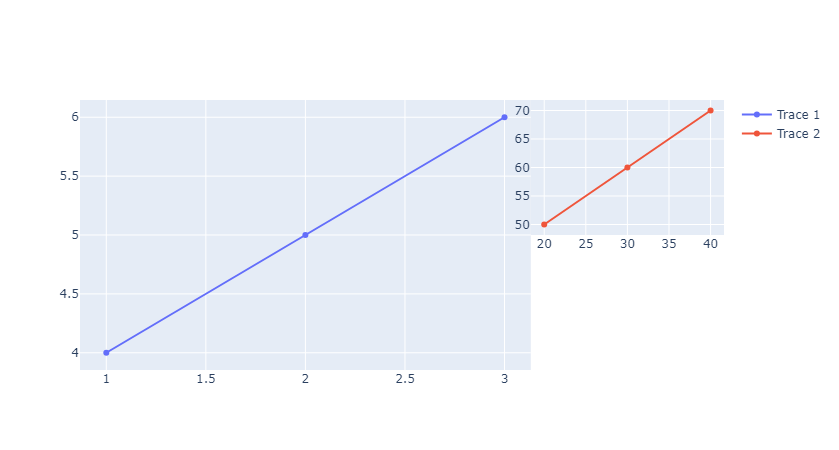
自由布局
自由布局則給予了我們更大的靈活性,通過domain參數(shù),我們可以手動設置子圖的位置,即指定子圖在圖表中的x和y坐標范圍。
這種方式非常適合實現(xiàn)一些非對齊排列的子圖布局,比如主圖與縮略圖的組合。
我們可以將主圖放在較大的區(qū)域,而將縮略圖放在角落,通過這種方式來輔助展示數(shù)據(jù)的局部細節(jié)。
# 自由布局

import plotly.graph_objects as go

# 自由布局示例
fig_free = go.Figure()

# 添加第一個子圖
fig_free.add_trace(go.Scatter(x=[1, 2, 3], y=[4, 5, 6], name="Trace 1"))

# 添加第二個子圖
fig_free.add_trace(go.Scatter(x=[20, 30, 40], y=[50, 60, 70], name="Trace 2"))

# 更新布局,定義每個子圖的domain
fig_free.update_layout(
    xaxis=dict(domain=[0, 0.7]),  # 第一個子圖占據(jù)左側70%
    yaxis=dict(domain=[0, 1]),    # 第一個子圖占據(jù)整個高度
    xaxis2=dict(domain=[0.7, 1], anchor="y2"),  # 第二個子圖占據(jù)右側30%
    yaxis2=dict(domain=[0.5, 1], anchor="x2")   # 第二個子圖在右側上方
)

# 更新每個trace的坐標軸引用
fig_free.update_traces(xaxis="x1", yaxis="y1", selector={"name": "Trace 1"})
fig_free.update_traces(xaxis="x2", yaxis="y2", selector={"name": "Trace 2"})

fig_free.show()
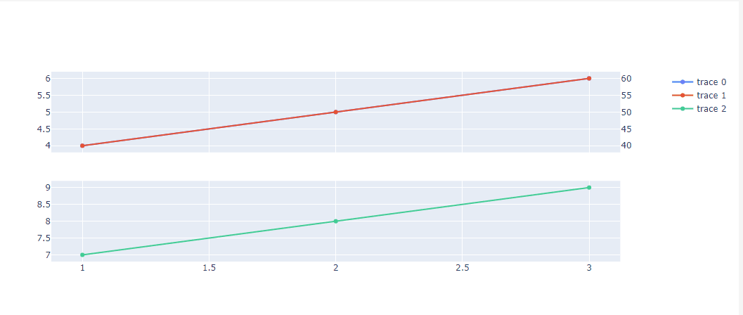
子圖共享坐標軸
在多子圖的情況下,共享坐標軸是一個非常實用的功能,通過設置shared_xaxes=True或shared_yaxes=True,可以讓多個子圖在同一個坐標軸上進行聯(lián)動。
這樣,當我們在一個子圖上進行縮放或平移操作時,其他共享相同坐標軸的子圖也會同步更新,從而方便我們進行多數(shù)據(jù)的對比分析。
此外,當遇到不同量綱的數(shù)據(jù)時,我們還可以通過secondary_y=True來獨立控制次坐標軸,避免因量綱沖突而導致圖表顯示不清晰。
fig = make_subplots(
    rows=2,
    cols=1,
    shared_xaxes=True,
    specs=[[{"secondary_y": True}], [{}]],
)

fig.add_trace(go.Scatter(x=[1, 2, 3], y=[4, 5, 6]), row=1, col=1)
fig.add_trace(go.Scatter(x=[1, 2, 3], y=[40, 50, 60]), row=1, col=1, secondary_y=True)
fig.add_trace(go.Scatter(x=[1, 2, 3], y=[7, 8, 9]), row=2, col=1)

fig.show()
實戰(zhàn)案例
下面兩個案例根據(jù)實際情況簡化而來,主要演示布局如何在實際項目中使用。
股票多指標分析儀表盤
示例中先構造一些模擬數(shù)據(jù),然后采用3行1列的布局模式來顯示不同的股票信息。
import plotly.graph_objects as go
from plotly.subplots import make_subplots
import pandas as pd

# 模擬股票數(shù)據(jù)
df = pd.DataFrame(
    {
        "date": pd.date_range(start="2023-01-01", periods=100),
        "price": [100 + i * 0.5 + (i % 10) * 2 for i in range(100)],
        "volume": [5000 + i * 10 + abs(i % 20 - 10) * 100 for i in range(100)],
        "rsi": [50 + i % 15 - 7.5 for i in range(100)],
    }
)

# 1. 創(chuàng)建3行1列的子圖布局
fig = make_subplots(
    rows=3,
    cols=1,
    shared_xaxes=True,  # 共享x軸
    vertical_spacing=0.05,  # 子圖間距
    subplot_titles=("價格趨勢", "成交量", "RSI 指標"),
)

# 2. 添加價格走勢圖
fig.add_trace(
    go.Candlestick(
        x=df["date"],
        open=df["price"] * 0.99,
        high=df["price"] * 1.02,
        low=df["price"] * 0.98,
        close=df["price"],
        name="股票價格",
    ),
    row=1,
    col=1,
)

# 3. 添加成交量柱狀圖
fig.add_trace(
    go.Bar(x=df["date"], y=df["volume"], name="成交量", marker_color="lightgray"),
    row=2,
    col=1,
)

# 4. 添加RSI指標圖
fig.add_trace(
    go.Scatter(x=df["date"], y=df["rsi"], name="RSI", line=dict(color="blue")),
    row=3,
    col=1,
)

# 5. 更新布局設置
fig.update_layout(
    title_text="多指標儀表盤",
    height=800,
    margin=dict(l=20, r=20, t=80, b=20),
    # 主圖坐標軸配置
    xaxis=dict(domain=[0, 1], rangeslider_visible=False),
    # 成交量圖坐標軸
    xaxis2=dict(domain=[0, 1], matches="x"),
    # RSI圖坐標軸
    xaxis3=dict(domain=[0, 1], matches="x"),
    # 公共y軸配置
    yaxis=dict(domain=[0.7, 1], showticklabels=False),
    yaxis2=dict(domain=[0.35, 0.65], showticklabels=False),
    yaxis3=dict(domain=[0, 0.3], tickformat=".0%"),
)

# 6. 添加形狀標注
fig.add_shape(
    type="line",
    x0="2023-01-01",
    y0=30,
    x1="2023-04-10",
    y1=70,
    line=dict(color="red", width=2, dash="dash"),
)

fig.show()
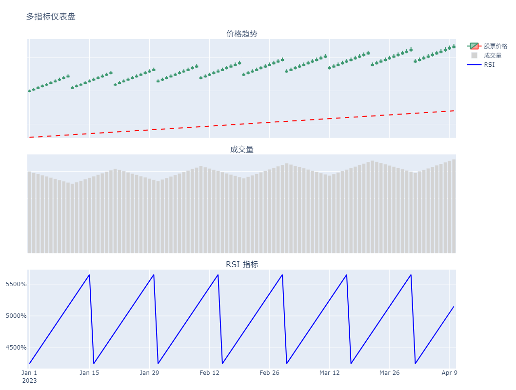
這是單列的布局,如果指標多的話,可以用多列的網(wǎng)格布局方式來布局。
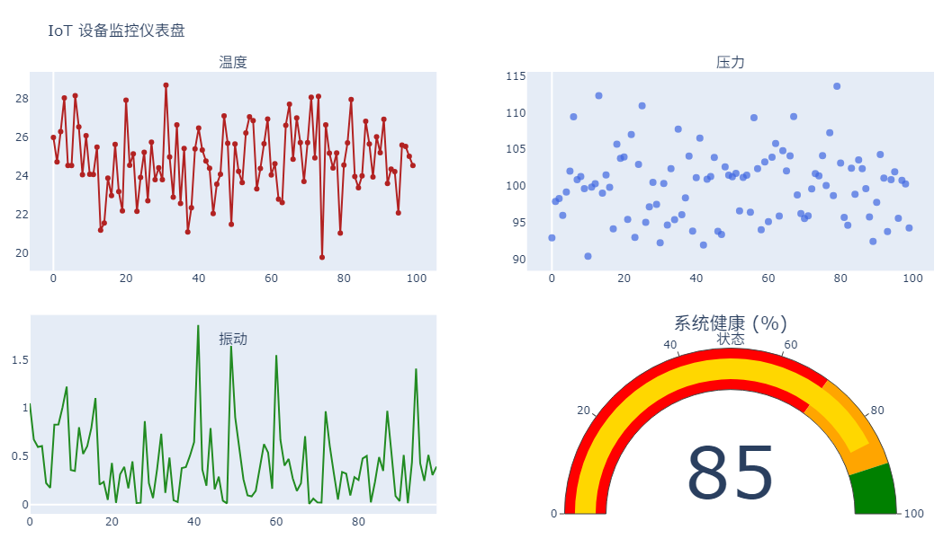
物聯(lián)網(wǎng)設備狀態(tài)監(jiān)控
這個示例采用自由布局實現(xiàn)主監(jiān)控圖+4個狀態(tài)指標環(huán)繞。
import plotly.graph_objects as go
from plotly.subplots import make_subplots
import numpy as np

# 模擬設備數(shù)據(jù)
np.random.seed(42)
device_data = {
    "timestamp": np.arange(100),
    "temp": 25 + np.random.normal(0, 2, 100),
    "pressure": 100 + np.random.normal(0, 5, 100),
    "vibration": np.random.exponential(0.5, 100),
}

# 1. 創(chuàng)建2行2列的子圖布局
fig = make_subplots(
    rows=2,
    cols=2,
    subplot_titles=("溫度", "壓力", "振動", "狀態(tài)"),
    specs=[
        [{"type": "scatter"}, {"type": "scatter"}],
        [{"type": "scatter"}, {"type": "indicator"}],
    ],
)

# 2. 添加溫度折線圖
fig.add_trace(
    go.Scatter(
        x=device_data["timestamp"],
        y=device_data["temp"],
        mode="lines+markers",
        name="溫度 (°C)",
        line=dict(color="firebrick"),
    ),
    row=1,
    col=1,
)

# 3. 添加壓力散點圖
fig.add_trace(
    go.Scatter(
        x=device_data["timestamp"],
        y=device_data["pressure"],
        mode="markers",
        name="壓力 (kPa)",
        marker=dict(size=8, color="royalblue", opacity=0.7),
    ),
    row=1,
    col=2,
)

# 4. 添加振動頻譜圖
fig.add_trace(
    go.Scatter(
        x=device_data["timestamp"],
        y=device_data["vibration"],
        mode="lines",
        name="振動 (g)",
        line=dict(color="forestgreen"),
    ),
    row=2,
    col=1,
)

# 5. 添加狀態(tài)指示器
fig.add_trace(
    go.Indicator(
        mode="gauge+number",
        value=85,
        domain={"x": [0, 1], "y": [0, 1]},
        title="系統(tǒng)健康 (%)",
        gauge={
            "axis": {"range": [0, 100]},
            "bar": {"color": "gold"},
            "steps": [
                {"range": [0, 70], "color": "red"},
                {"range": [70, 90], "color": "orange"},
                {"range": [90, 100], "color": "green"},
            ],
        },
    ),
    row=2,
    col=2,
)

# 6. 更新布局設置
fig.update_layout(
    title_text="IoT 設備監(jiān)控儀表盤",
    height=600,
    margin=dict(l=20, r=20, t=80, b=20),
    showlegend=False,
    # 溫度圖坐標軸
    xaxis=dict(domain=[0, 0.45], showgrid=False),
    yaxis=dict(domain=[0.55, 1], showgrid=False),
    # 壓力圖坐標軸
    xaxis2=dict(domain=[0.55, 1], showgrid=False),
    yaxis2=dict(domain=[0.55, 1], showgrid=False),
    # 振動圖坐標軸
    xaxis3=dict(domain=[0, 0.45], showgrid=False),
    yaxis3=dict(domain=[0, 0.45], showgrid=False),
)

fig.show()
總結
在Plotly中,子圖布局對于創(chuàng)建高質量的數(shù)據(jù)可視化作品至關重要。
在實際應用中,對于復雜的儀表盤項目,優(yōu)先采用網(wǎng)格布局可以保證子圖之間的對齊和一致性;而對于一些創(chuàng)意性的場景,自由布局則能夠更好地發(fā)揮我們的想象力。

 浙公網(wǎng)安備 33010602011771號