
Qt | 在qcustomplot自定義圖例項顯示方式,實現復選框圖例控制曲線可見性
需求
在項目中有一個數據展示需求,要求曲線和曲線對應的文字說明垂直對齊,且文字說明欄需要帶有控制曲線顯示/隱藏的復選框,并且復選框旁邊需要顯示對應曲線的顏色。
于是第一時間考慮到使用qcustomplot這個第三方庫,因為本身qcustomplot就自帶標簽欄(legend)和在標簽欄上顯示的圖例(legenditem)。
qcustomplot默認使用示例
void Widget::demo1()
{
    QVBoxLayout* layout = new QVBoxLayout(this);
    QCustomPlot *customPlot = new QCustomPlot(this);
    layout->addWidget(customPlot);

    // 當傳參為空時,addGraph會自動添加xAxis,yAxis,這里添加兩條曲線
    customPlot->addGraph();
    customPlot->addGraph();

    auto graph1 = customPlot->graph(0);
    auto graph2 = customPlot->graph(1);
    graph1->setPen(QPen(Qt::blue));
    graph1->setName("曲線1");  // 默認的名稱為graph + 1 + 索引
    graph2->setPen(QPen(Qt::red));
    graph2->setName("曲線2");

    // 準備數據
    QVector<double> x(101), y1(101), y2(101); // 創建數據點向量
    for (int i=0; i<101; ++i)
        {
            x[i] = i/50.0 - 1; // x 范圍從 -1 到 1
            y1[i] = x[i]*x[i] + QRandomGenerator::global()->generateDouble() * 0.5; // y = x^2 + 隨機偏移
            y2[i] = -x[i]*x[i] + QRandomGenerator::global()->generateDouble() * 0.5; // y = -x^2 + 隨機偏移
        }

    // 為圖形設置數據
    graph1->setData(x, y1);
    graph2->setData(x, y2);


    // 設置坐標軸標簽
    customPlot->xAxis->setLabel("x");
    customPlot->yAxis->setLabel("y");


    // 設置軸的自適應
    customPlot->rescaleAxes();

    // 設置坐標軸范圍
    // customPlot->xAxis->setRange(-1, 1);
    // customPlot->yAxis->setRange(0, 1);

    // 設置item可見
    customPlot->legend->setVisible(true);
    customPlot->legend->setFillOrder(QCPLegend::foColumnsFirst);

    customPlot->axisRect()->insetLayout()->setInsetAlignment(0, Qt::AlignBottom|Qt::AlignHCenter);
    // 移動圖例到坐標系的下方

    // 重新繪制圖表以顯示曲線
    customPlot->replot();
}
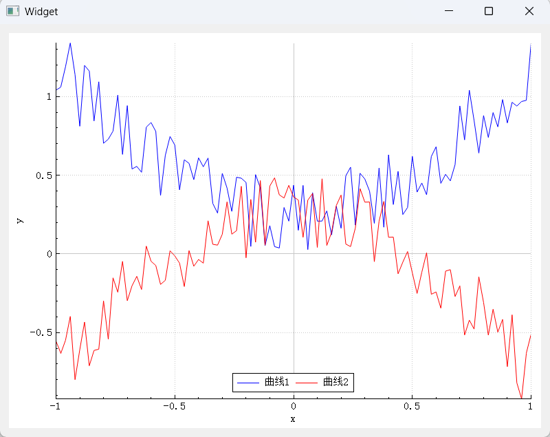
基礎方式實現效果如圖
調整legend位置
可以看到,即便調整了legend中item的排列方式,以及legend的位置,item還是處于坐標系中,這就導致會遮擋一部分的曲線。最終實現的效果應該是legend處于坐標系的最下方,且水平寬度與qcustomplot相同。
通過閱讀源碼,發現qcustomplot存在一個主布局QCPLayoutGrid(網格布局) ,默認的坐標系defaultAxisRect會被添加到這個主布局中,而legend會被添加到defaultAxisRect,所以接下來要做的就是,將原有的legend位置換一下。
在原有的代碼中添加如下代碼
// 設置item可見
customPlot->legend->setVisible(true);
// 關閉自動添加到圖例中
customPlot->setAutoAddPlottableToLegend(false);
// 以列填充優先,一列滿了后就填充下一列,默認是行優先
customPlot->legend->setFillOrder(QCPLegend::foColumnsFirst);
customPlot->plotLayout()->addElement(1,0,customPlot->legend);
// 設置legend的高度為20
customPlot->legend->setMaximumSize(QWIDGETSIZE_MAX, 20);
// 重新繪制圖表以顯示曲線
實現效果

源碼閱讀
到這里布局問題已經完成了,但是復選框圖例項還沒有實現,這里看了下源碼,需要寫一個自定義的圖例類來替代原有的圖例項,原有的圖例類QCPPlottableLegendItem是繼承自QCPAbstractLegendItem這個類,QCPPlottableLegendItem繪制圖例項的源碼如下:

可以看到原生item是根據初始化時,會傳入自帶的一個legend,和一個plottable,這個plottable在查看源碼時,發現實際上是一個graph,所以當給qcustomplot->graph(idx)->setName(nameStr)后,自動生成的item會在draw中獲取graph的name,并繪制出一個item。結合這個源碼,實現一個帶復選框的自定義item就很簡單了,只需要自定義一個LegendItem,并重寫對應的draw函數。
在重寫時還發現一個問題,這個方法是QCPAbstractPlottable抽象類的一個接口,不同的plottable有著對應的實現,如果重寫后需要調用這個方法,則需要對源碼進行修改,實際上只需要添加一行代碼:在QCPAbstractPlottable的頭文件中將當前自定義item類聲明為QCPAbstractPlottable的友元即可
mPlottable->drawLegendIcon(painter, iconRect);
qcustomplot的item是通過QPainter繪制出來的,所以說用不了QCheckBox,這里我也是使用的QPainter進行繪制
繪制的方式是畫一個矩形(帶圓角的),然后在矩形內部畫三個點連接起來(可以找現有的復選框效果進行模仿繪制),這里發現開啟抗鋸齒后復選框會有邊緣模糊的效果,不開則比較銳利。
實現的自定義item如下:
#ifndef CUSTOMLEGENDITEM_H
#define CUSTOMLEGENDITEM_H

#include "qcustomplot/qcustomplot.h"
class CustomLegendItem :public QCPPlottableLegendItem {
Q_OBJECT
public:
explicit CustomLegendItem(QCPAbstractPlottable *plottable, QCPLegend *parentLegend, const QString &text = "");
~CustomLegendItem();

protected:
virtual void draw(QCPPainter *painter) Q_DECL_OVERRIDE;
virtual void mousePressEvent(QMouseEvent *event, const QVariant &details) Q_DECL_OVERRIDE;
virtual void mouseDoubleClickEvent(QMouseEvent *event, const QVariant &details) Q_DECL_OVERRIDE;

signals:
void checkboxStateChanged(bool checked);

private:
void initConnection();

private:
bool mCheckBoxChecked;
int mCheckBoxSize;
QRect mCheckBoxRect;
QColor mCheckBoxBorderColor = Qt::black;
QColor mCheckBoxCheckedColor = Qt::blue;
int mIconTextSpacing;  // 圖標與文字之間的間距
int mTotalHorizontalPadding;  // 整體水平方向的內邊距
void drawCheckBox(QCPPainter *painter);
void handleMousePressEvent(QMouseEvent *event);

};
#endif // CUSTOMLEGENDITEM_H

#include "customlegenditem.h"
CustomLegendItem::CustomLegendItem(QCPAbstractPlottable *plottable, QCPLegend *parentLegend, const QString &text)
: QCPPlottableLegendItem(parentLegend, plottable)
{
    setSelectable(true);
    this->setAntialiased(true);
}

CustomLegendItem::~CustomLegendItem()
{

}

// 重寫draw函數
void CustomLegendItem::draw(QCPPainter *painter)
{
    if (!mPlottable) return;

    mCheckBoxSize = 18;
    mIconTextSpacing = 5;  // 可以根據實際需求調整間距大小
    mTotalHorizontalPadding = 10;  // 整體水平方向預留的內邊距,可按需調整

    int yCenter = mRect.y() + mRect.height() / 2;
    int startX = mRect.x() + mTotalHorizontalPadding;

    // 計算總寬度
    QSize iconSize = mParentLegend->iconSize();
    QFontMetrics fm(getFont());
    int textWidth = fm.horizontalAdvance(mPlottable->name());
    int totalWidth = mTotalHorizontalPadding * 2 + mCheckBoxSize + mIconTextSpacing * 2 + iconSize.width() + textWidth;

    // 更新mRect以適應新內容
    mRect.setWidth(totalWidth);
    mRect.setHeight(qMax(fm.height(), mCheckBoxSize));

    // 繪制復選框
    mCheckBoxRect = QRect(startX, yCenter - mCheckBoxSize / 2, mCheckBoxSize, mCheckBoxSize);
    drawCheckBox(painter);
    startX += mCheckBoxSize + mIconTextSpacing;

    // 繪制圖標
    QRect iconRect(startX, yCenter - iconSize.height() / 2, iconSize.width(), iconSize.height());
    painter->save();
    painter->setClipRect(iconRect, Qt::IntersectClip);
    mPlottable->drawLegendIcon(painter, iconRect);
    painter->restore();
    startX += iconSize.width() + mIconTextSpacing;

    // 繪制文字
    painter->setFont(getFont());
    painter->setPen(QPen(getTextColor()));
    QRect textRect = painter->fontMetrics().boundingRect(mPlottable->name());
    int textHeight = qMax(textRect.height(),mCheckBoxRect.height());
    int textY = yCenter - textHeight / 2; // 根據文本高度居中
    painter->drawText(startX, textY, textRect.width(), textHeight, Qt::TextDontClip, mPlottable->name());

    // draw icon border:
    if (getIconBorderPen().style()!= Qt::NoPen)
    {
        painter->setPen(getIconBorderPen());
        painter->setBrush(Qt::NoBrush);
        int halfPen = qCeil(painter->pen().widthF()*0.5)+1;
        painter->setClipRect(mOuterRect.adjusted(-halfPen, -halfPen, halfPen, halfPen));
        painter->drawRect(iconRect);
    }
}

// 自繪復選框的函數實現
void CustomLegendItem::drawCheckBox(QCPPainter *painter)
{
    painter->setPen(Qt::black);  // 設置畫筆顏色,可調整
    painter->setBrush(Qt::NoBrush);

    QPen checkBoxBorderPen(Qt::black,2);
    QPen checkBoxCheckedPen(QColor(64,65,66),2);
    QPen checkBoxUnCheckedPen(QColor(216,232,232),2);

    // 繪制對號
    int padding = 3; // 內邊距,可根據實際大小調整
    QPoint topLeft(mCheckBoxRect.topLeft() + QPoint(padding, padding));
    QPoint bottomRight(mCheckBoxRect.bottomRight() - QPoint(padding, padding));
    QRect checkBoxArea(topLeft, bottomRight);

    auto w = checkBoxArea.width();
    auto h = checkBoxArea.height();
    auto x = checkBoxArea.x();
    auto y = checkBoxArea.y();

    // √從左至右分解為3個點,分別是ABC三點
    // A
    QPoint aPos(x + w/10,y + h/2);
    QPoint bPos(x + w/3, y + 4*h/5);
    QPoint cPos(x + 9 * w/10,y + h/3);

    if (mCheckBoxChecked)
    {
        painter->setPen(checkBoxCheckedPen);
    }
    else
    {
        painter->setPen(checkBoxUnCheckedPen);
    }
    painter->drawLine(aPos,bPos);
    painter->drawLine(bPos,cPos);

    painter->setPen(checkBoxBorderPen);
    painter->drawRoundedRect(mCheckBoxRect,5,5);
}

void CustomLegendItem::initConnection()
{

}

// 處理鼠標點擊事件的函數實現
void CustomLegendItem::handleMousePressEvent(QMouseEvent *event)
{
    if (mCheckBoxRect.contains(event->pos()))
    {
        mCheckBoxChecked =!mCheckBoxChecked;  // 切換復選框狀態
        mPlottable->setVisible(mCheckBoxChecked);
        emit checkboxStateChanged(mCheckBoxChecked);  // 發出狀態改變的信號
        // 更新繪制,使復選框顯示最新狀態
        mPlottable->parentPlot()->replot();
    }
}

void CustomLegendItem::mousePressEvent(QMouseEvent *event, const QVariant &details)
{
    handleMousePressEvent(event);
}

void CustomLegendItem::mouseDoubleClickEvent(QMouseEvent *event, const QVariant &details)
{
    handleMousePressEvent(event);
}
最終使用這個item時,需要禁止自動添加圖例項
this->setAutoAddPlottableToLegend(false);
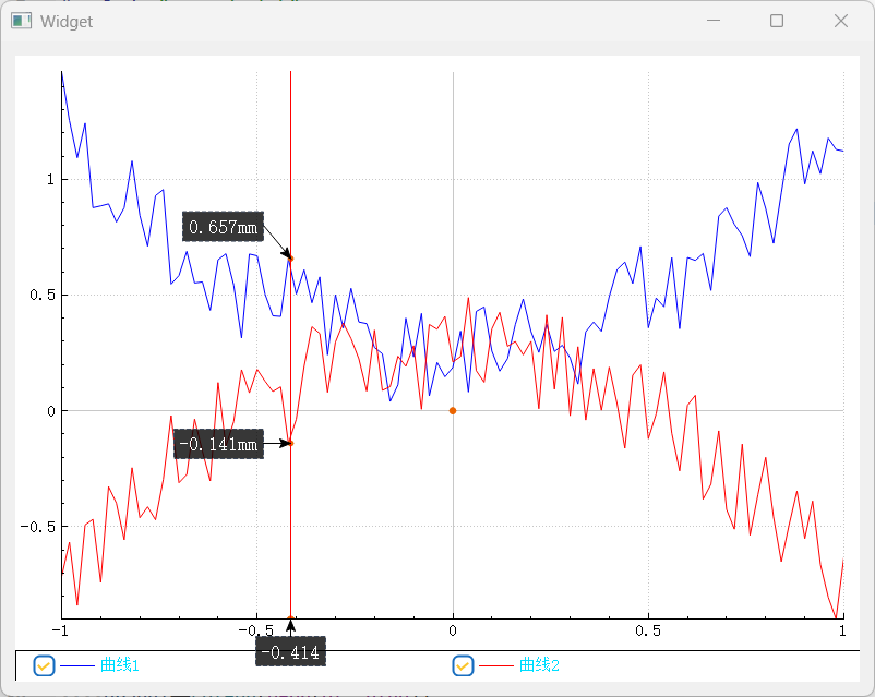
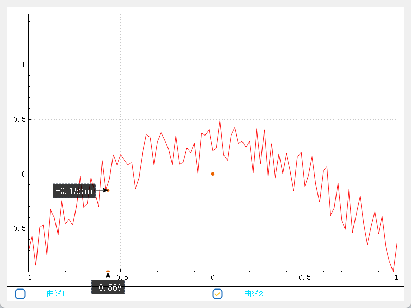
最終效果
最終在項目中使用時,我是重新封裝了一個CheckBoxItemGraphPlot類,繼承自qcustomplot,并重寫addGraph,在addGraph方法中進行item項的添加,最終實現效果(封裝的這個類還添加了鼠標追蹤功能,鼠標追蹤的標簽會自動計算重合點,避免標簽重合等功能)
效果1
效果2

 浙公網安備 33010602011771號