
openpyxl
一、Excel
1、Excel文件三個對象
workbook: 工作簿,一個excel文件包含多個sheet。
sheet:工作表,一個workbook有多個,表名識別,如“sheet1”,“sheet2”等。
cell: 單元格,存儲數據對象
2、excel定義的圖
excel定義的圖分兩級類別描述,第一級分別有九大類,如下所示
area: 面積圖
bar: 轉置直方圖
column: 柱狀圖
line: 直線圖
pie: 餅狀圖
doughnut: 環形圖
scatter: 散點圖
stock: 股票趨勢圖
radar: 雷達圖
3、csv格式讀寫excel數據
現在我們已經在 Python 中拿到了想要的數據,對于這些數據我們可以先存放起來,比如把數據寫入 csv 中。定義一個 writeDate 方法:
import csv #導入包

def writeData(data, name):
    with open(name, 'a', errors='ignore', newline='') as f:
            f_csv = csv.writer(f)
            f_csv.writerows(data)
    print('write_csv success')
writeData(result, 'D:/py_work/venv/Include/weather.csv') #數據寫入到 csv文檔中
二、python與excel
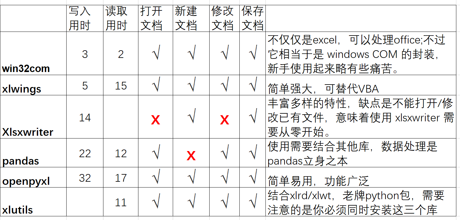
1、python處理excel主流代表有:
三、openpyxl基本用法
openpyxl專門處理Excel2007及以上版本產生的xlsx文件,可讀可寫excel表。
openpyxl定義了多種數據格式其中最重要的三種:
NULL空值:對應于python中的None,表示這個cell里面沒有數據。
numberic: 數字型,統一按照浮點數來進行處理。對應于python中的float。
string: 字符串型,對應于python中的unicode。
openpyxl中有三個不同層次的類:
Workbook是對工作簿的抽象,
Worksheet是對表格的抽象,
Cell是對單元格的抽象,
1、Workbook:
一個Workbook對象代表一個Excel文檔,因此在操作Excel之前,都應該先創建一個Workbook對象。
對于創建一個新的Excel文檔,直接進行Workbook類的調用即可,對于一個已經存在的Excel文檔,可以使用openpyxl模塊的load_workbook函數進行讀取。
一個工作簿(workbook)在創建的時候同時至少也新建了一張工作表(worksheet)。
1)Workbook屬性:
●active:獲取當前活躍的Worksheet
●worksheets:以列表的形式返回所有的Worksheet(表格)
●read_only:判斷是否以read_only模式打開Excel文檔
●encoding:獲取文檔的字符集編碼
●properties:獲取文檔的元數據,如標題,創建者,創建日期等
●sheetnames:獲取工作簿中的表(列表)
1.2Workbook方法(大部分方法都與sheet有關):
●get_sheet_names:獲取所有表格的名稱(新版已經不建議使用,通過Workbook的sheetnames屬性即可獲取)
●get_sheet_by_name:通過表格名稱獲取Worksheet對象(新版也不建議使用,通過Worksheet[‘表名‘]獲取)
●get_active_sheet:獲取活躍的表格(新版建議通過active屬性獲取)
●remove_sheet:刪除一個表格
●create_sheet:創建一個空的表格
●copy_worksheet:在Workbook內拷貝表格
2、Worksheet:
有了Worksheet對象以后,我們可以通過這個Worksheet對象獲取表格的屬性,得到單元格中的數據,修改表格中的內容。
1)Worksheet屬性:
●title:表格的標題
●row_dimensions[2].height = 40 # 第2行行高
●column_dimensions['C'].width = 30 # C列列寬
●max_row:表格的最大行
●min_row:表格的最小行
●max_column:表格的最大列
●min_column:表格的最小列
●rows:按行獲取單元格(Cell對象) - 生成器
●columns:按列獲取單元格(Cell對象) - 生成器
●freeze_panes:凍結窗格
●values:按行獲取表格的內容(數據) - 生成器
2)Worksheet方法:
●iter_rows:按行獲取所有單元格,內置屬性有(min_row,max_row,min_col,max_col)
●iter_columns:按列獲取所有的單元格
●append:在表格末尾添加數據
●merged_cells:合并多個單元格
●unmerged_cells:移除合并的單元格
3、Cell:
1)Cell屬性:
●row:單元格所在的行
●column:單元格坐在的列
●value:單元格的值
●coordinate:單元格的坐標 # excel2[‘abc‘].cell(row=1,column=2).coordinate
2)單元格樣式
openpyxl的單元格樣式由6種屬性決定,每一種都是一個類,如下所示:
●font(字體類):字號、字體顏色、下劃線等
●fill(填充類):顏色等
●border(邊框類):設置單元格邊框
●alignment(位置類):對齊方式
●number_format(格式類):數據格式
●protection(保護類):寫保護
基本字體顏色
字體顏色有一些顏色常量,可以直接調用:
from openpyxl.styles import Font
from openpyxl.styles.colors import RED
font = Font(color=RED)
font = Font(color="00FFBB00")
4、openpyxl圖表:
Area Charts: 面積圖
Bar and Column Charts : 轉置直方圖
Bubble Charts
Line Charts: 直線圖
Scatter Charts: 散點圖
Pie Charts: 餅狀圖
Doughnut Charts: 環形圖
Radar Charts: 雷達圖
Stock Charts: 股票趨勢圖
Surface Charts
column: 柱狀圖
四、使用介紹
1、Workbook
import openpyxl
WB=openpyxl.Workbook() #新建一個工作簿(workbook)
WB.save('xxx.xlsx') #保存并關閉工作簿

import openpyxl
WB=openpyxl.Workbook() #新建一個工作簿(workbook)
sh=WB.active #激活
WB.save('xxx.xlsx') #保存并關閉工作簿


import openpyxl
WB=openpyxl.load_workbook(filename = 'xxx.xlsx')#調用已有的工作簿(workbook)
WB.save('xxx.xlsx') #保存并關閉工作簿

import openpyxl
wb = openpyxl.load_workbook(filename = 'xxx.xlsx')#調用已有的工作簿(workbook)
sh = wb['Sheet'] #通過sheet名來訪問sheet
print(sh['D18'].value) #獲取cell值
2、worksheet
新建sheet
import openpyxl
wb=openpyxl.load_workbook(filename = 'xxx.xlsx')#調用已有的工作簿(workbook)

ws1=wb.active#調用正在運行的工作表

ws2 = wb.create_sheet() #新建sheet
ws4 = wb.create_sheet("NewTitle") #新建sheet并設定sheet名稱

ws3 = wb.create_sheet(index=0) #新建sheet并指定sheet位置次序。系統自動命名,依次為Sheet, Sheet1, Sheet2
ws5 = wb.create_sheet('Data',index=1)#新建工作表并設定sheet名稱,指定sheet位置次序

ws5.title = "NewTitle2" # 修改sheet表名稱,直接賦值即可

ws7= wb["Sheet1"] #通過名字打開sheet

wb.remove(ws7) #刪除某個工作表

wb.save('xxx.xlsx')
獲取名字
import openpyxl
WB=openpyxl.load_workbook(filename = 'xxx.xlsx')#調用已有的工作簿(workbook)
sh1=WB.active

aa=WB.sheetnames[5] #按次序獲取第6個sheet名
print(aa)

bb=WB.sheetnames #獲取所有sheet名
print(bb)

cc=sh1.title #獲取sheet名,默認取最后創建的那個sheet的名稱
print(cc)

dd=['深圳市', '2020-09-02', '15:50:00', '08:00:00', '1970-01-01', '一達通未簽約']
f=bb[3] #第四個sheet頁的名稱
sh2=WB[f] #按名稱獲取sheet
sh2.append(dd)#寫數據
print(sh2.title)#獲取當前sheet名

WB.save('xxx.xlsx') #保存并關閉工作簿
讀取excel數據
#讀取xlsx
from openpyxl import load_workbook
wb = load_workbook("C:\\Programs\\PythonTest3\\000.xlsx")   # 打開一個xlsx文件。load_workbook(filepath) 可以對已存在的 .xlsx 進行追加數據
sheet = wb.active
# sheet = wb["Sheet1"]  # 讀取指定的Sheet頁

e_list=[]

# for i in sheet.values:
#     print(list(i))

# for row in sheet.iter_rows(values_only=True):
#     print(row) #數據是按行顯示的

for i in sheet.values:
    e_list.append(list(i))
print(e_list)
寫入excel數據
#寫入xlsx
from openpyxl import Workbook
wb = Workbook()  # 創建一個工作表
sheet = wb.active  # 找到活動的sheet頁。空的excel表默認的sheet頁就叫Sheet

sheet.title = "Sheet2"  # 為默認sheet頁命名
sheet=wb.create_sheet('價格頁')  # 創建sheet頁,并指定為當前操作頁。可以用create_sheet和remove_sheet進行添加和刪除sheet頁

sheet['C3'] = 'Hello world!'  # 往sheet頁里面寫內容
for i in range(10):
    sheet[f"A{i+1}"].value = i + 1

sheet["E1"].value = "=SUM(A:A)" # 寫寫公式
wb.save('000.xlsx')  # 保存


from openpyxl import Workbook
workbook = Workbook()  #覆蓋寫
worksheet = workbook.active

row=[1,2,3,4,5]
rows = [["AA", 2019],["FF", 2018],["KK", 2019],["CC", 2020],["BB", 2017],["GG", 2018],["DD", 2019],["EE", 2018]]

worksheet.append(row)#添加一行

for i in rows:      #添加多行
    worksheet.append(i) # 把每一行append到worksheet中

workbook.save('000.xlsx')


from openpyxl import load_workbook
wb=wb = load_workbook("C:\\Programs\\PythonTest3\\000.xlsx") #追加寫
ws=wb.active

row=[1,2,3,4,5]
rows=[['Num','a','d'],[2,40,30],[3,40,25],[4,50,30],[5,30,10],[6,25,5],[7,50,10],]

ws.append(row) #添加一行

for row in rows: #添加多行
    ws.append(row)

wb.save("000.xlsx")
讀寫單元格
import openpyxl

wb=openpyxl.load_workbook(filename = 'xxx.xlsx')#調用已有的工作簿(workbook)
ws=wb.active

d1=ws.max_column #獲得最大列
d2=ws.max_row #獲得最大行

wb["sheet33"].max_row #獲得最大列
wb["sheet33"].max_column #獲得最大行

d3=ws['A4'] #根據單元格的索引獲取單元格,如果不存在將在A4新建一個
d3=ws["B3"].value #取值
d4=ws.cell(row = 4, column = 2) #使用cell()方法通過行列獲取單元格(行號列號從1開始)
d4=ws.cell(row=3, column=2).value #取值

cell_range1= ws['C']  #獲取C列,cell_range1是tuple類型
cell_range2= ws[6] #獲取第10行
cell_range3= ws['C:D']#獲取C到D列
cell_range4= ws[3:7] #獲取第3到7行
cell_range5= ws['A1':'C2'] #使用切片獲取多個單元格
ws.rows #迭代讀取所有行row ,生成器,里面是每一行的數據,每一行都是一個tuple。
ws.columns #迭代讀取所有列column

#輸出cell_range1和cell_range2的數據
for row in cell_range1:
  print(row.value)

#輸出cell_range3、cell_range4和cell_range5的數據
for row in cell_range3:
  for cell in row:
    print(cell.value)

#按行返回所有數據
for row in ws.rows:
    for cell in row:
        print(cell.value)

#按列返回所有數據
for column in ws.columns:
    for cell in column:
        print(cell.value)

ws['A4'] = 4  #直接給單元格賦值
ws['A4'].value = 5  #給單元格賦值
ws.cell(row = 4, column = 2).value = 'test1' #通過cell函數給單元格賦值
ws.cell(row = 4, column = 2) value = 'test2' #通過cell函數給單元格賦值
ws["A1"] = "=SUM(1, 1)"  #通過公式計算產生寫入的值
ws["A1"] = "=SUM(B1:C1)" #通過公式計算產生寫入的值
ws['B9']='=AVERAGE(B2:B8)' #通過公式計算產生寫入的值,讀取時需加data_only=True這樣讀到B9返回的就是數字,否則返回的將是公式本身'=AVERAGE(B2:B8)'

wb.save('xxx.xlsx')
行列相關
import openpyxl
wb=openpyxl.load_workbook(filename = 'xxx.xlsx')

#插入行,列
wb["Sheet1"].insert_rows(4)     #在第四行之前插入空行
wb["Sheet1"].insert_cols(3)     #在第三列之前插入空列
wb["Sheet1"].append([1,2,3])    #默認在最大行之后一行,開始從第一列到第三列插入1,2,3這三個值

#刪除行列
wb["Sheet1"].delete_rows(3)     #刪除第三行
wb["Sheet1"].delete_cols(2)     #刪除第二列
wb["Sheet1"].delete_rows(2,8)   #刪除第二行到第九行 ,讀者請注意:刪除多行時是刪除到8行之后的一行,列也是同樣
wb["Sheet1"].delete_cols(2,3)   #刪除第二列到第四列

wb.save('xxx.xlsx')
自適應設置各列寬度
import openpyxl

wb= openpyxl.Workbook()
ws=wb.active

column_widths = []
for row in sh.columns:
    for i, cell in enumerate(row):
        if len(column_widths) > i:
            if len(str(cell.value)) > column_widths[i]:
                column_widths[i] = len(str(cell.value))
        else:
            column_widths.append(len(str(cell.value)))

column_widths.reverse()#對最大寬度列表進行逆序

#設置各列寬度。enumerate()返回列表的下標和值
for i, column_width in enumerate(column_widths):
    sh.column_dimensions[chr(i+97)].width = column_width*2

wb.save('xxx.xlsx')
單元格設置
import openpyxl
from openpyxl.styles import Font, Fill
import datetime
from openpyxl.styles import PatternFill, Border, Side, Alignment, Font

wb=openpyxl.load_workbook(filename = 'xxx.xlsx')#調用已有的工作簿(workbook)
ws=wb.active

#合并單元格
ws.merge_cells('D6:E6')#合并一行中的幾個單元格,合并后只可以往左上角寫入數據,若這些單元格都有數據,則只會保留左上角的數據,其他則丟棄
ws.merge_cells(start_row=6,start_column=4,end_row=6,end_column=5)#合并一行中的幾個單元格
ws.merge_cells('A1:C3')#合并一個矩形區域中的單元格
ws.merge_cells(start_row=1,start_column=1,end_row=3,end_column=3)#合并一個矩形區域中的單元格

#拆分單元格
ws.unmerge_cells('A1:C3')#拆分后,值回到A1位置。

#設置樣式
c = ws['A1'].font = Font(size=14) #可以直接應用到單元格

ws.column_dimensions['B'].width=2 #設置B列寬度
ws.row_dimensions[2].height=2 #設置第2行高度

ws.column_dimensions['B'].hidde=1 #隱藏B列
ws.row_dimensions[2].hidde=1 #隱藏第2行

#單元格默認樣式如下:
#字體
font = Font(name='Calibri',size=11,bold=False,italic=False,vertAlign=None,underline='none',strike=False,color='FF000000')
#填充
fill = PatternFill(fill_type=None,start_color='FFFFFFFF',end_color='FF000000')
#邊框
border = Border(left=Side(border_style=None,color='FF000000'),
             right=Side(border_style=None,color='FF000000'),
             top=Side(border_style=None,color='FF000000'),
             bottom=Side(border_style=None,color='FF000000'),
             diagonal=Side(border_style=None,color='FF000000'),
             diagonal_direction=0,
             outline=Side(border_style=None,color='FF000000'),
             vertical=Side(border_style=None,color='FF000000'),
             horizontal=Side(border_style=None,color='FF000000'))
#位置
alignment=Alignment(horizontal='general',vertical='bottom',text_rotation=0,wrap_text=False,shrink_to_fit=False,indent=0)

#單元格數據格式
ws.cell['D2].number_format = 'General'
ws['A1'] = datetime.datetime(2010, 7, 21)
ws.cell(row=2, column=4).number_format = 'd-mmm-yy'
ws['A1'].number_format #'yyyy-mm-dd h:mm:ss'

wb.save('xxx.xlsx')
插入一個圖片
from openpyxl import Workbook
from openpyxl.drawing.image import Image

wb = Workbook()
ws = wb.active

img = Image('logo.png')
ws.add_image(img, 'A1')

wb.save('logo.xlsx')
把文本寫入excel
import openpyxl

fe=openpyxl.Workbook()
fs=fe.create_sheet("tt")

with open("C:\\Programs\\PythonTest3\\info.txt",'r',encoding="utf-8") as fwd:
    for line in fwd.readlines():
        fs.append([line])#openpyxl中寫入Excel的數據需是列表型的,所先先將每行放入列表,再將列表放入列表
fe.save("C:\\Programs\\PythonTest3\\000.xlsx")
五、圖表
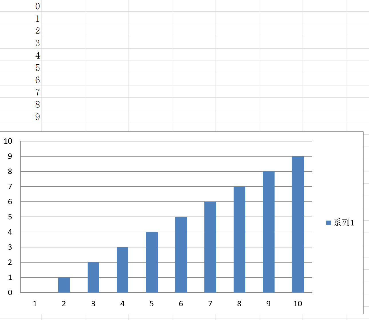
1創建一個圖表
from openpyxl import Workbook
from openpyxl.chart import BarChart, Reference, Series

wb = Workbook()
ws = wb.active

for i in range(10):
    ws.append([i])

values = Reference(ws, min_col=1, min_row=1, max_col=1, max_row=10)
chart = BarChart()
chart.add_data(values)
ws.add_chart(chart, "E15")
wb.save("SampleChart.xlsx")
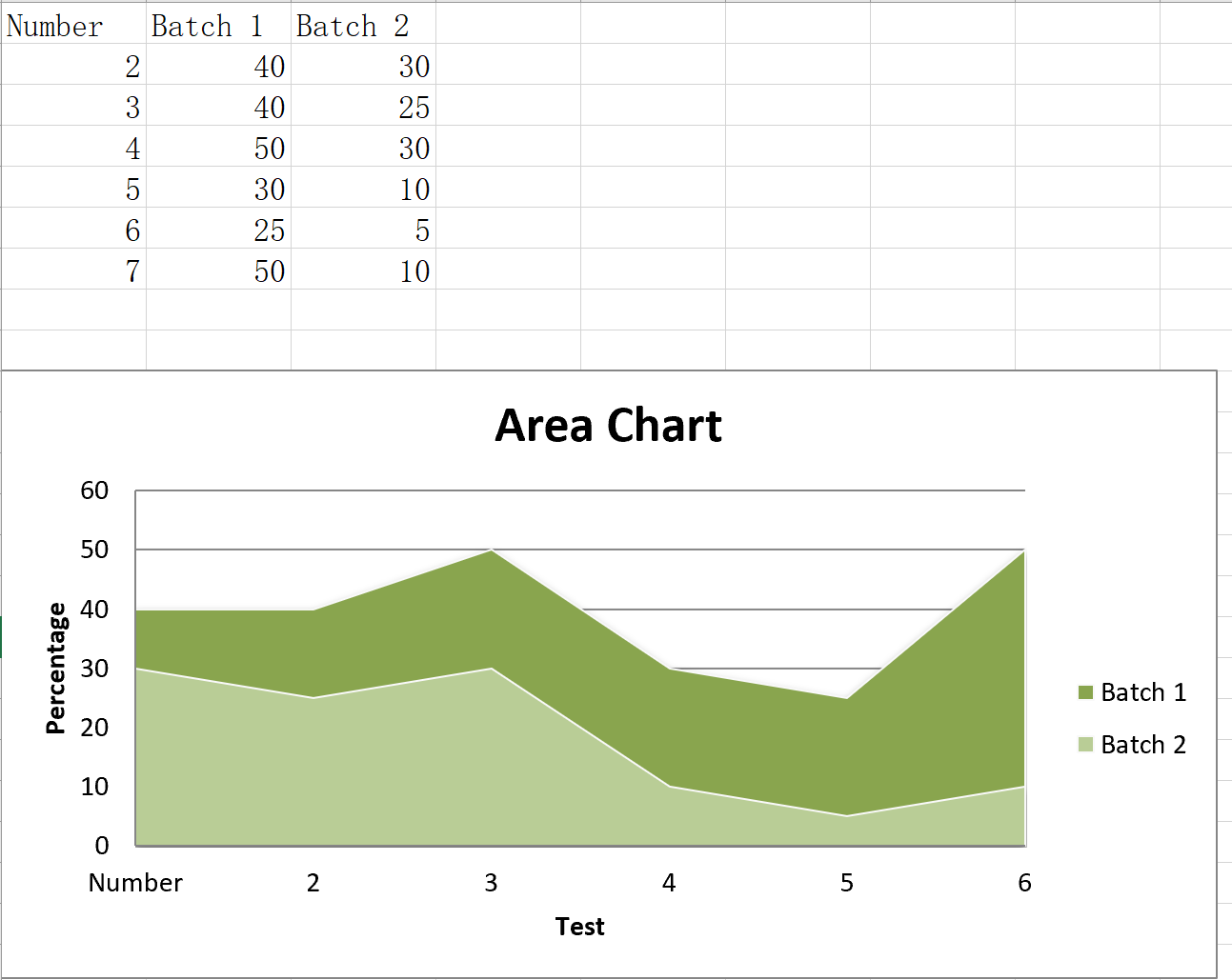
2面積圖(二維)
面積圖類似于直線圖
from openpyxl import Workbook
from openpyxl.chart import AreaChart,Reference,Series

wb = Workbook()
ws = wb.active

rows = [
    ['Number', 'Batch 1', 'Batch 2'],
    [2, 40, 30],
    [3, 40, 25],
    [4, 50, 30],
    [5, 30, 10],
    [6, 25, 5],
    [7, 50, 10],
]

for row in rows:
    ws.append(row)

chart = AreaChart()
chart.title = "Area Chart"
chart.style = 13
chart.x_axis.title = 'Test'
chart.y_axis.title = 'Percentage'

cats = Reference(ws, min_col=1, min_row=1, max_row=7)
data = Reference(ws, min_col=2, min_row=1, max_col=3, max_row=7)
chart.add_data(data, titles_from_data=True)
chart.set_categories(cats)

ws.add_chart(chart, "A10")

wb.save("area.xlsx")
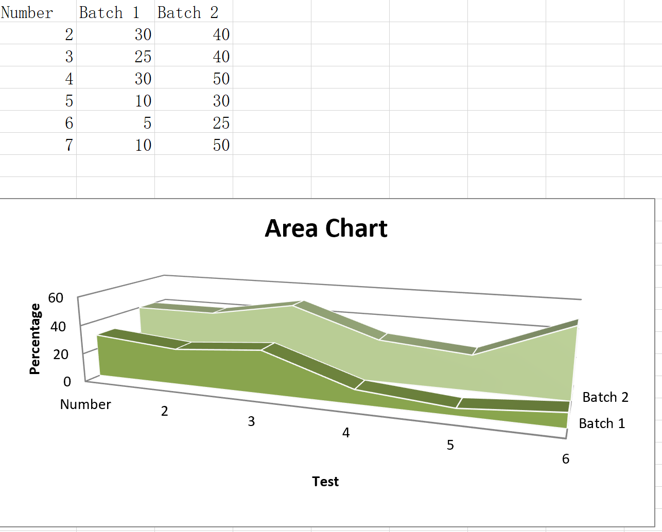
3面積圖(三維)
from openpyxl import Workbook
from openpyxl.chart import AreaChart3D,Reference,Series

wb = Workbook()
ws = wb.active

rows = [
    ['Number', 'Batch 1', 'Batch 2'],
    [2, 30, 40],
    [3, 25, 40],
    [4 ,30, 50],
    [5 ,10, 30],
    [6,  5, 25],
    [7 ,10, 50],
]

for row in rows:
    ws.append(row)

chart = AreaChart3D()
chart.title = "Area Chart"
chart.style = 13
chart.x_axis.title = 'Test'
chart.y_axis.title = 'Percentage'
chart.legend = None

cats = Reference(ws, min_col=1, min_row=1, max_row=7)
data = Reference(ws, min_col=2, min_row=1, max_col=3, max_row=7)
chart.add_data(data, titles_from_data=True)
chart.set_categories(cats)

ws.add_chart(chart, "A10")

wb.save("area3D.xlsx")
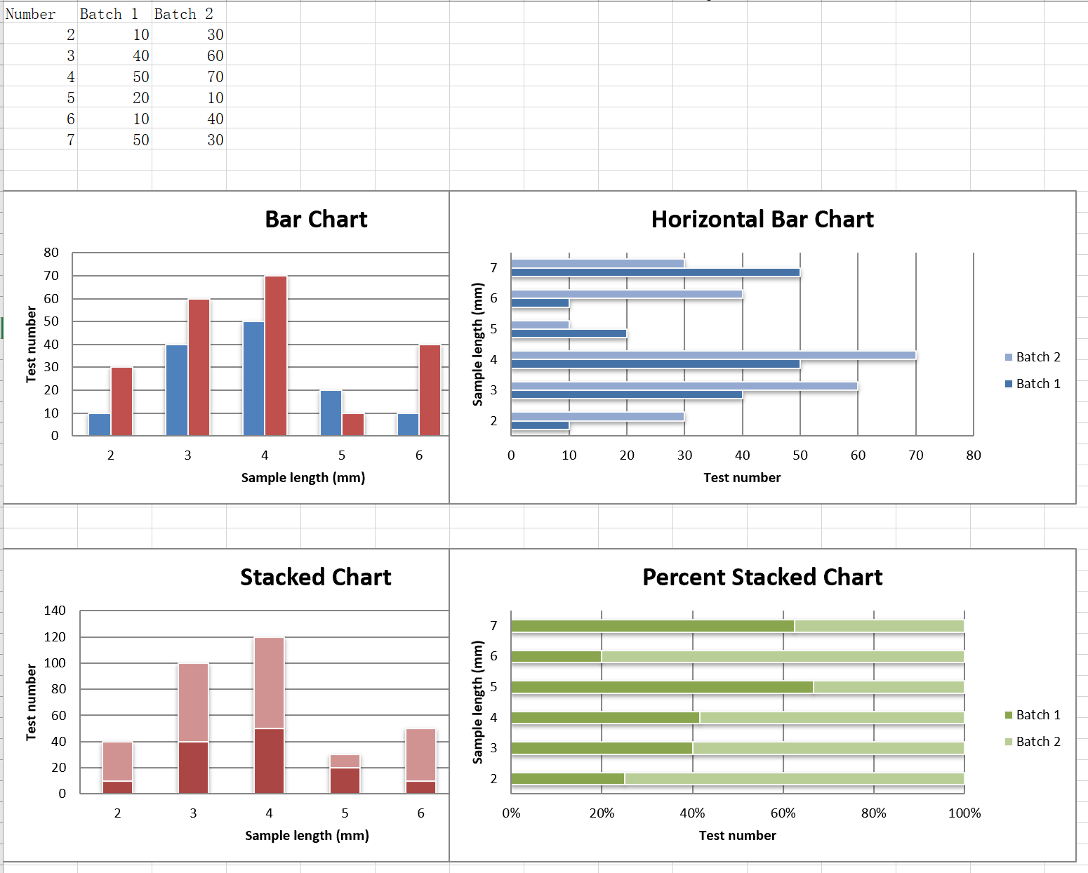
4柱狀圖表
垂直、水平和堆疊柱形圖表
from openpyxl import Workbook
from openpyxl.chart import BarChart, Series, Reference

wb = Workbook(write_only=True)
ws = wb.create_sheet()

rows = [
    ('Number', 'Batch 1', 'Batch 2'),
    (2, 10, 30),
    (3, 40, 60),
    (4, 50, 70),
    (5, 20, 10),
    (6, 10, 40),
    (7, 50, 30),
]

for row in rows:
    ws.append(row)

chart1 = BarChart()
chart1.type = "col"
chart1.style = 10
chart1.title = "Bar Chart"
chart1.y_axis.title = 'Test number'
chart1.x_axis.title = 'Sample length (mm)'

data = Reference(ws, min_col=2, min_row=1, max_row=7, max_col=3)
cats = Reference(ws, min_col=1, min_row=2, max_row=7)
chart1.add_data(data, titles_from_data=True)
chart1.set_categories(cats)
chart1.shape = 4
ws.add_chart(chart1, "A10")

from copy import deepcopy

chart2 = deepcopy(chart1)
chart2.style = 11
chart2.type = "bar"
chart2.title = "Horizontal Bar Chart"

ws.add_chart(chart2, "G10")


chart3 = deepcopy(chart1)
chart3.type = "col"
chart3.style = 12
chart3.grouping = "stacked"
chart3.overlap = 100
chart3.title = 'Stacked Chart'

ws.add_chart(chart3, "A27")


chart4 = deepcopy(chart1)
chart4.type = "bar"
chart4.style = 13
chart4.grouping = "percentStacked"
chart4.overlap = 100
chart4.title = 'Percent Stacked Chart'

ws.add_chart(chart4, "G27")

wb.save("bar.xlsx")
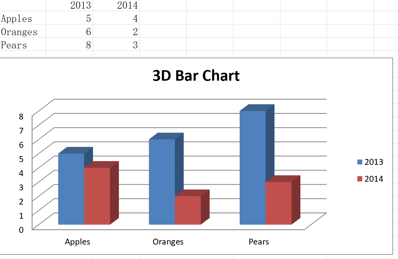
5柱狀圖表(三維)
from openpyxl import Workbook
from openpyxl.chart import Reference,Series,BarChart3D

wb = Workbook()
ws = wb.active

rows = [
    (None, 2013, 2014),
    ("Apples", 5, 4),
    ("Oranges", 6, 2),
    ("Pears", 8, 3)
]

for row in rows:
    ws.append(row)

data = Reference(ws, min_col=2, min_row=1, max_col=3, max_row=4)
titles = Reference(ws, min_col=1, min_row=2, max_row=4)
chart = BarChart3D()
chart.title = "3D Bar Chart"
chart.add_data(data=data, titles_from_data=True)
chart.set_categories(titles)

ws.add_chart(chart, "E5")
wb.save("bar3d.xlsx")
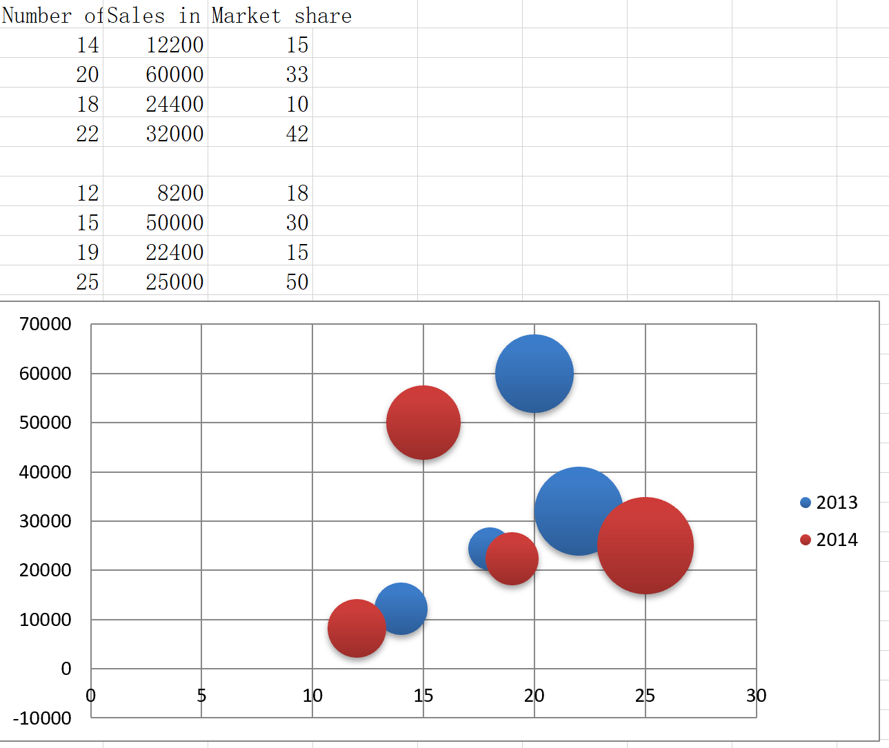
6泡沫圖表(bubble chart)
泡沫圖類似于散點圖但使用第三個維度確定氣泡的大小。 圖表可以包括多個系列。
from openpyxl import Workbook
from openpyxl.chart import Series, Reference, BubbleChart

wb = Workbook()
ws = wb.active

rows = [
    ("Number of Products", "Sales in USD", "Market share"),
    (14, 12200, 15),
    (20, 60000, 33),
    (18, 24400, 10),
    (22, 32000, 42),
    (),
    (12, 8200, 18),
    (15, 50000, 30),
    (19, 22400, 15),
    (25, 25000, 50),
]

for row in rows:
    ws.append(row)

chart = BubbleChart()
chart.style = 18 # use a preset style

# add the first series of data
xvalues = Reference(ws, min_col=1, min_row=2, max_row=5)
yvalues = Reference(ws, min_col=2, min_row=2, max_row=5)
size = Reference(ws, min_col=3, min_row=2, max_row=5)
series = Series(values=yvalues, xvalues=xvalues, zvalues=size, title="2013")
chart.series.append(series)

# add the second
xvalues = Reference(ws, min_col=1, min_row=7, max_row=10)
yvalues = Reference(ws, min_col=2, min_row=7, max_row=10)
size = Reference(ws, min_col=3, min_row=7, max_row=10)
series = Series(values=yvalues, xvalues=xvalues, zvalues=size, title="2014")
chart.series.append(series)

# place the chart starting in cell E1
ws.add_chart(chart, "E1")
wb.save("bubble.xlsx")
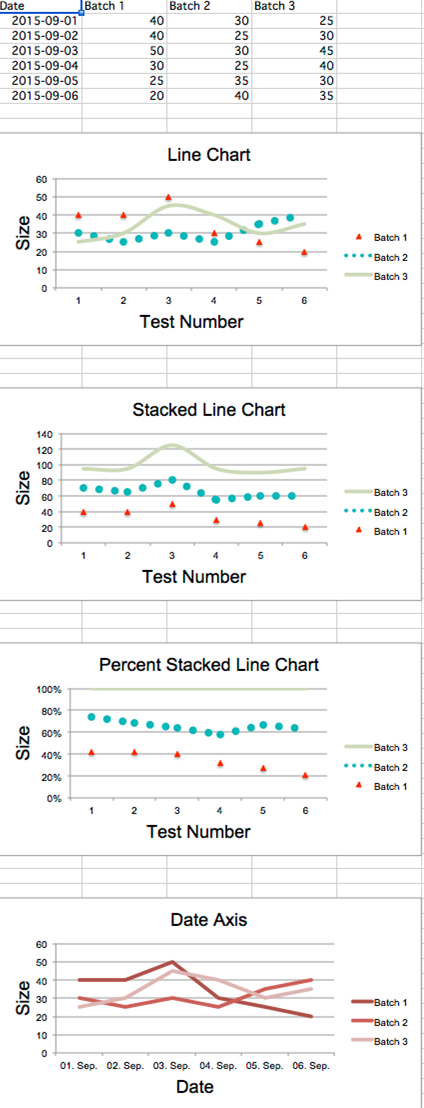
7線圖表
線圖表允許數據繪制與固定軸。類似于條形圖有三種線路圖:標準、堆放、percentStacked。
from datetime import date
from openpyxl import Workbook
from openpyxl.chart import LineChart,Reference
from openpyxl.chart.axis import DateAxis
from copy import deepcopy

wb = Workbook()
ws = wb.active

rows = [
    ['Date', 'Batch 1', 'Batch 2', 'Batch 3'],
    [date(2015,9, 1), 40, 30, 25],
    [date(2015,9, 2), 40, 25, 30],
    [date(2015,9, 3), 50, 30, 45],
    [date(2015,9, 4), 30, 25, 40],
    [date(2015,9, 5), 25, 35, 30],
    [date(2015,9, 6), 20, 40, 35],
]

for row in rows:
    ws.append(row)

#Line Chart
c1 = LineChart()
c1.title = "Line Chart"
c1.style = 13
c1.y_axis.title = 'Size'
c1.x_axis.title = 'Test Number'
data = Reference(ws, min_col=2, min_row=1, max_col=4, max_row=7)
c1.add_data(data, titles_from_data=True)

# Style the lines
s1 = c1.series[0]
s1.marker.symbol = "triangle"
s1.marker.graphicalProperties.solidFill = "FF0000" # Marker filling
s1.marker.graphicalProperties.line.solidFill = "FF0000" # Marker outline
s1.graphicalProperties.line.noFill = True

s2 = c1.series[1]
s2.graphicalProperties.line.solidFill = "00AAAA"
s2.graphicalProperties.line.dashStyle = "sysDot"
s2.graphicalProperties.line.width = 100050 # width in EMUs

s2 = c1.series[2]
s2.smooth = True # Make the line smooth

ws.add_chart(c1, "A10")

#Stacked Line Line表
stacked = deepcopy(c1)
stacked.grouping = "stacked"
stacked.title = "Stacked Line Chart"
ws.add_chart(stacked, "A27")

#Percent Stacked Line表
percent_stacked = deepcopy(c1)
percent_stacked.grouping = "percentStacked"
percent_stacked.title = "Percent Stacked Line Chart"
ws.add_chart(percent_stacked, "A44")

# date axis表
c2 = LineChart()
c2.title = "Date axis Chart"
c2.style = 2 #線條的style,Max value is 48   2 10

#設置Y軸
c2.y_axis.title = "Size"
#c2.y_axis.crossAx = 100
c2.y_axis.scaling.min = 0  #y坐標的區間
c2.y_axis.scaling.max = 70 #y坐標的區間

#設置X軸
c2.x_axis.title = "Date"
#c2.x_axis = DateAxis(crossAx=100)
c2.x_axis.number_format = 'd-mmm'  #規定日期格式
c2.x_axis.majorTimeUnit = "days"   #規定日期間隔
dates2 = Reference(ws, min_col=1, min_row=2, max_col=1, max_row=7) #引用由行列所描述的區域內的數據
c2.set_categories(dates2) #設置X軸坐標類別

#向圖表中加入數據
dates = Reference(ws, min_col=2, min_row=1, max_col=4, max_row=7) #引用由行列所描述的區域內的數據
c2.add_data(dates, titles_from_data=True)

#設置圖表在表格中的起始位置
ws.add_chart(c2, "A61")

#保存表格
wb.save("line.xlsx")
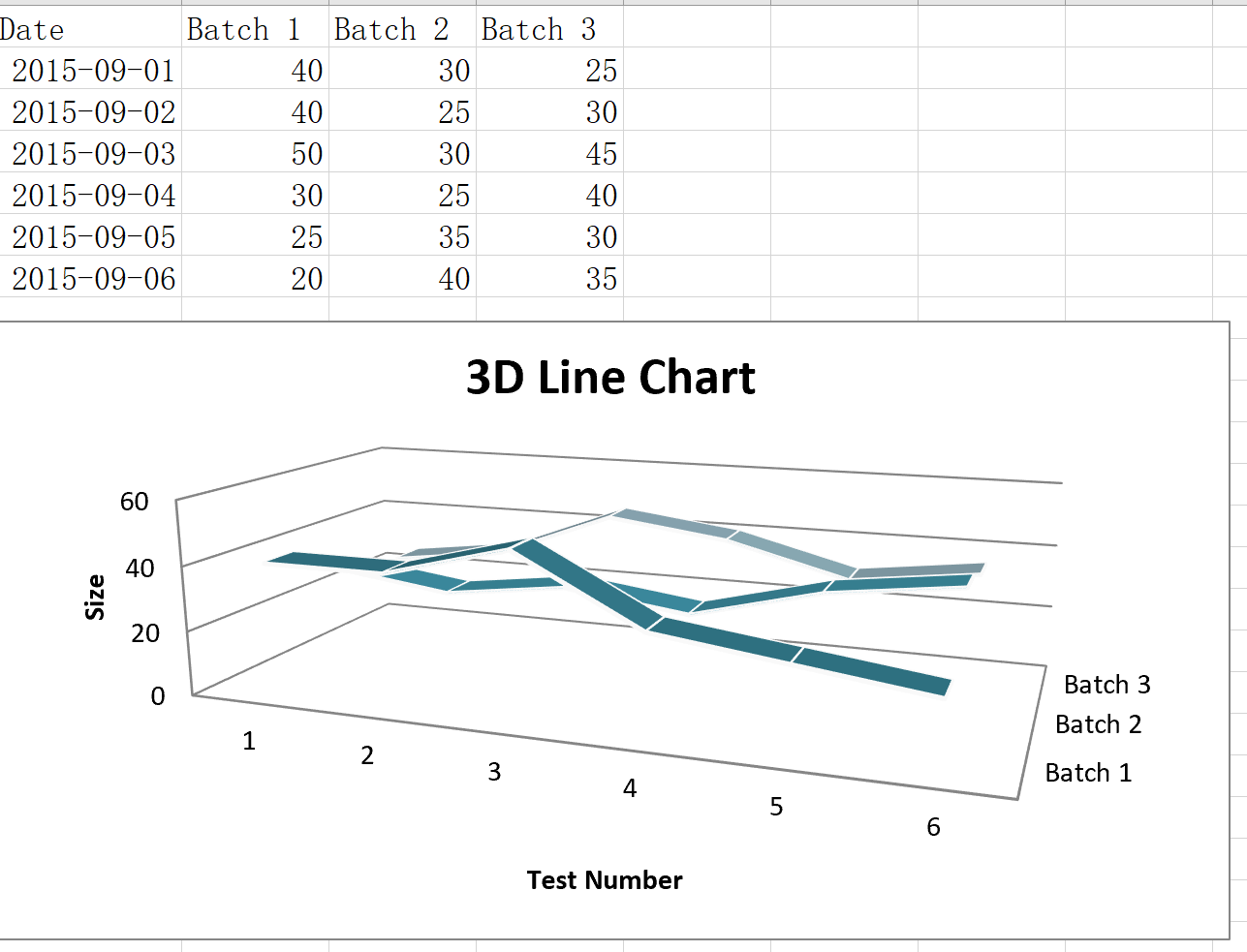
8線圖表(三維)
from datetime import date
from openpyxl import Workbook
from openpyxl.chart import LineChart3D, Reference
from openpyxl.chart.axis import DateAxis

wb = Workbook()
ws = wb.active

rows = [
    ['Date', 'Batch 1', 'Batch 2', 'Batch 3'],
    [date(2015,9, 1), 40, 30, 25],
    [date(2015,9, 2), 40, 25, 30],
    [date(2015,9, 3), 50, 30, 45],
    [date(2015,9, 4), 30, 25, 40],
    [date(2015,9, 5), 25, 35, 30],
    [date(2015,9, 6), 20, 40, 35],
]

for row in rows:
    ws.append(row)

c1 = LineChart3D()
c1.title = "3D Line Chart"
c1.legend = None
c1.style = 15
c1.y_axis.title = 'Size'
c1.x_axis.title = 'Test Number'

data = Reference(ws, min_col=2, min_row=1, max_col=4, max_row=7)
c1.add_data(data, titles_from_data=True)

ws.add_chart(c1, "A10")

wb.save("line3D.xlsx")
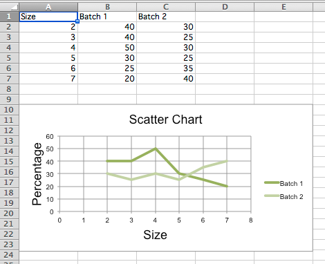
9散點圖
分散、xy圖類似于一些線形圖。 的主要區別 是一個系列策劃反對另一個值。 這是有用的, 值是無序的。
from openpyxl import Workbook
from openpyxl.chart import ScatterChart,Reference,Series

wb = Workbook()
ws = wb.active

rows = [
    ['Size', 'Batch 1', 'Batch 2'],
    [2, 40, 30],
    [3, 40, 25],
    [4, 50, 30],
    [5, 30, 25],
    [6, 25, 35],
    [7, 20, 40],
]

for row in rows:
    ws.append(row)

chart = ScatterChart()
chart.title = "Scatter Chart"
chart.style = 13
chart.x_axis.title = 'Size'
chart.y_axis.title = 'Percentage'

xvalues = Reference(ws, min_col=1, min_row=2, max_row=7)
for i in range(2, 4):
    values = Reference(ws, min_col=i, min_row=1, max_row=7)
    series = Series(values, xvalues, title_from_data=True)
    chart.series.append(series)

ws.add_chart(chart, "A10")

wb.save("scatter.xlsx")
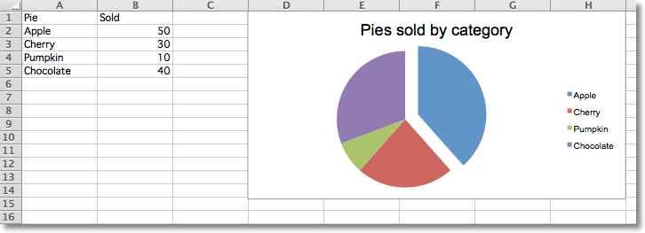
10餅圖
餅圖繪制數據作為一個圓片每片代表 整體的百分比。 片繪制在順時針方向為0° 在頂部的圓。 餅圖只能把一個系列的 數據。 圖表的標題將默認的標題。
from openpyxl import Workbook
from openpyxl.chart import PieChart,ProjectedPieChart,Reference
from openpyxl.chart.series import DataPoint

data = [
    ['Pie', 'Sold'],
    ['Apple', 50],
    ['Cherry', 30],
    ['Pumpkin', 10],
    ['Chocolate', 40],
]

wb = Workbook()
ws = wb.active

for row in data:
    ws.append(row)

pie = PieChart()
labels = Reference(ws, min_col=1, min_row=2, max_row=5)
data = Reference(ws, min_col=2, min_row=1, max_row=5)
pie.add_data(data, titles_from_data=True)
pie.set_categories(labels)
pie.title = "Pies sold by category"

# Cut the first slice out of the pie
slice = DataPoint(idx=0, explosion=20)
pie.series[0].data_points = [slice]

ws.add_chart(pie, "D1")


ws = wb.create_sheet(title="Projection")

data = [
    ['Page', 'Views'],
    ['Search', 95],
    ['Products', 4],
    ['Offers', 0.5],
    ['Sales', 0.5],
]

for row in data:
    ws.append(row)

projected_pie = ProjectedPieChart()
projected_pie.type = "pie"
projected_pie.splitType = "val" # split by value
labels = Reference(ws, min_col=1, min_row=2, max_row=5)
data = Reference(ws, min_col=2, min_row=1, max_row=5)
projected_pie.add_data(data, titles_from_data=True)
projected_pie.set_categories(labels)

ws.add_chart(projected_pie, "A10")

from copy import deepcopy
projected_bar = deepcopy(projected_pie)
projected_bar.type = "bar"
projected_bar.splitType = 'pos' # split by position

ws.add_chart(projected_bar, "A27")

wb.save("pie.xlsx")
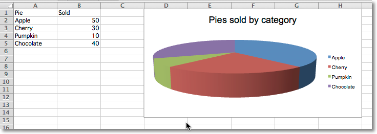
11餅圖(三維)
from openpyxl import Workbook
from openpyxl.chart import PieChart3D,Reference

data = [
    ['Pie', 'Sold'],
    ['Apple', 50],
    ['Cherry', 30],
    ['Pumpkin', 10],
    ['Chocolate', 40],
]

wb = Workbook()
ws = wb.active

for row in data:
    ws.append(row)

pie = PieChart3D()
labels = Reference(ws, min_col=1, min_row=2, max_row=5)
data = Reference(ws, min_col=2, min_row=1, max_row=5)
pie.add_data(data, titles_from_data=True)
pie.set_categories(labels)
pie.title = "Pies sold by category"

ws.add_chart(pie, "D1")

wb.save("pie3D.xlsx")
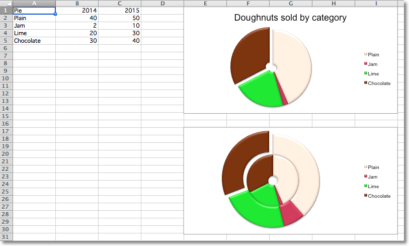
12散列餅圖
油炸圈餅圖表類似于餅圖,除了他們使用一枚戒指 一個圓。 他們還可以情節幾個系列的數據如同心圓。
from openpyxl import Workbook
from openpyxl.chart import DoughnutChart,Reference,Series
from openpyxl.chart.series import DataPoint

data = [
    ['Pie', 2014, 2015],
    ['Plain', 40, 50],
    ['Jam', 2, 10],
    ['Lime', 20, 30],
    ['Chocolate', 30, 40],
]

wb = Workbook()
ws = wb.active

for row in data:
    ws.append(row)

chart = DoughnutChart()
labels = Reference(ws, min_col=1, min_row=2, max_row=5)
data = Reference(ws, min_col=2, min_row=1, max_row=5)
chart.add_data(data, titles_from_data=True)
chart.set_categories(labels)
chart.title = "Doughnuts sold by category"
chart.style = 26

# Cut the first slice out of the doughnut
slices = [DataPoint(idx=i) for i in range(4)]
plain, jam, lime, chocolate = slices
chart.series[0].data_points = slices
plain.graphicalProperties.solidFill = "FAE1D0"
jam.graphicalProperties.solidFill = "BB2244"
lime.graphicalProperties.solidFill = "22DD22"
chocolate.graphicalProperties.solidFill = "61210B"
chocolate.explosion = 10

ws.add_chart(chart, "E1")

from copy import deepcopy

chart2 = deepcopy(chart)
chart2.title = None
data = Reference(ws, min_col=3, min_row=1, max_row=5)
series2 = Series(data, title_from_data=True)
series2.data_points = slices
chart2.series.append(series2)

ws.add_chart(chart2, "E17")

wb.save("doughnut.xlsx")
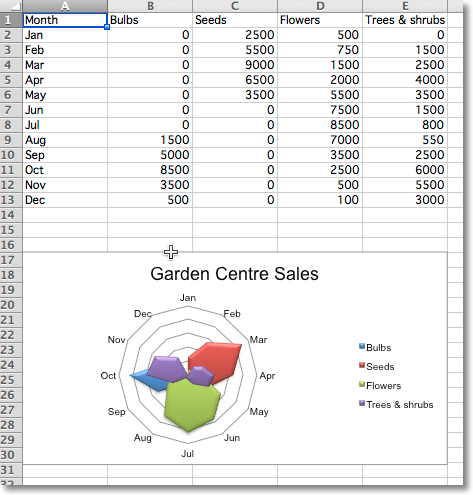
13雷達圖表
數據按行或列在一個表可以繪制雷達圖表。 雷達圖表比較多個數據的聚合值 系列。 它實際上是一個圓軸的投影面積圖。
from openpyxl import Workbook
from openpyxl.chart import RadarChart,Reference

wb = Workbook()
ws = wb.active

rows = [
    ['Month', "Bulbs", "Seeds", "Flowers", "Trees & shrubs"],
    ['Jan', 0, 2500, 500, 0,],
    ['Feb', 0, 5500, 750, 1500],
    ['Mar', 0, 9000, 1500, 2500],
    ['Apr', 0, 6500, 2000, 4000],
    ['May', 0, 3500, 5500, 3500],
    ['Jun', 0, 0, 7500, 1500],
    ['Jul', 0, 0, 8500, 800],
    ['Aug', 1500, 0, 7000, 550],
    ['Sep', 5000, 0, 3500, 2500],
    ['Oct', 8500, 0, 2500, 6000],
    ['Nov', 3500, 0, 500, 5500],
    ['Dec', 500, 0, 100, 3000 ],
]

for row in rows:
    ws.append(row)

chart = RadarChart()
chart.type = "filled"
labels = Reference(ws, min_col=1, min_row=2, max_row=13)
data = Reference(ws, min_col=2, max_col=5, min_row=1, max_row=13)
chart.add_data(data, titles_from_data=True)
chart.set_categories(labels)
chart.style = 26
chart.title = "Garden Centre Sales"
chart.y_axis.delete = True

ws.add_chart(chart, "A17")

wb.save("radar.xlsx")
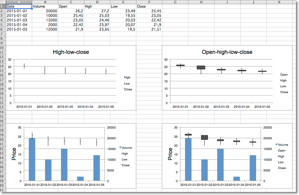
14股票圖表
from datetime import date
from openpyxl import Workbook
from openpyxl.chart import BarChart,StockChart,Reference,Series
from openpyxl.chart.axis import DateAxis, ChartLines
from openpyxl.chart.updown_bars import UpDownBars

wb = Workbook()
ws = wb.active

rows = [
   ['Date',      'Volume','Open', 'High', 'Low', 'Close'],
   ['2015-01-01', 20000,    26.2, 27.20, 23.49, 25.45,  ],
   ['2015-01-02', 10000,    25.45, 25.03, 19.55, 23.05, ],
   ['2015-01-03', 15000,    23.05, 24.46, 20.03, 22.42, ],
   ['2015-01-04', 2000,     22.42, 23.97, 20.07, 21.90, ],
   ['2015-01-05', 12000,    21.9, 23.65, 19.50, 21.51,  ],
]

for row in rows:
    ws.append(row)

# High-low-close
c1 = StockChart()
labels = Reference(ws, min_col=1, min_row=2, max_row=6)
data = Reference(ws, min_col=4, max_col=6, min_row=1, max_row=6)
c1.add_data(data, titles_from_data=True)
c1.set_categories(labels)
for s in c1.series:
    s.graphicalProperties.line.noFill = True
# marker for close
s.marker.symbol = "dot"
s.marker.size = 5
c1.title = "High-low-close"
c1.hiLowLines = ChartLines()

# Excel is broken and needs a cache of values in order to display hiLoLines :-/
from openpyxl.chart.data_source import NumData, NumVal
pts = [NumVal(idx=i) for i in range(len(data) - 1)]
cache = NumData(pt=pts)
c1.series[-1].val.numRef.numCache = cache

ws.add_chart(c1, "A10")

# Open-high-low-close
c2 = StockChart()
data = Reference(ws, min_col=3, max_col=6, min_row=1, max_row=6)
c2.add_data(data, titles_from_data=True)
c2.set_categories(labels)
for s in c2.series:
    s.graphicalProperties.line.noFill = True
c2.hiLowLines = ChartLines()
c2.upDownBars = UpDownBars()
c2.title = "Open-high-low-close"

# add dummy cache
c2.series[-1].val.numRef.numCache = cache

ws.add_chart(c2, "G10")

# Create bar chart for volume

bar = BarChart()
data =  Reference(ws, min_col=2, min_row=1, max_row=6)
bar.add_data(data, titles_from_data=True)
bar.set_categories(labels)

from copy import deepcopy

# Volume-high-low-close
b1 = deepcopy(bar)
c3 = deepcopy(c1)
c3.y_axis.majorGridlines = None
c3.y_axis.title = "Price"
b1.y_axis.axId = 20
b1.z_axis = c3.y_axis
b1.y_axis.crosses = "max"
b1 += c3

c3.title = "High low close volume"

ws.add_chart(b1, "A27")

## Volume-open-high-low-close
b2 = deepcopy(bar)
c4 = deepcopy(c2)
c4.y_axis.majorGridlines = None
c4.y_axis.title = "Price"
b2.y_axis.axId = 20
b2.z_axis = c4.y_axis
b2.y_axis.crosses = "max"
b2 += c4

ws.add_chart(b2, "G27")

wb.save("stock.xlsx")

 浙公網安備 33010602011771號