

Flexible Box布局基礎知識詳解
1.基本概念,借用阮一峰老師的一張圖:
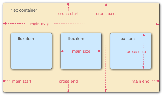
容器默認存在兩根軸:水平的主軸(main axis)和垂直的交叉軸(cross axis)。主軸的開始位置(與邊框的交叉點)叫做main start,結束位置叫做main end;交叉軸的開始位置叫做cross start,結束位置叫做cross end。
項目默認沿主軸排列。單個項目占據的主軸空間叫做main size,占據的交叉軸空間叫做cross size。
2.容器的基本屬性
flex-direction
flex-wrap
flex-flow
justify-content
align-items
align-content
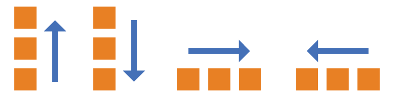
2.1 flex-direction 屬性決定主軸的方向 (及行排列)
 .box{
            flex-direction:row | row-reverse | column |column-reverse   /*有四個值  分別的顯示效果*/
        }
默認值:row
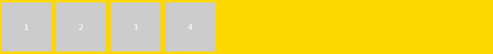
html5實現代碼:
  <div class="box">
          <div class="box-item">1</div>
          <div class="box-item">2</div>
          <div class="box-item">3</div>
          <div class="box-item">4</div>
   </div>
css3部分實現代碼:
 body{
           margin: 0 auto;
           width: 1000px;
        }
         .box{
             background: gold;
             margin: 1px;
             display: flex;  /*必須設置這個*/
             flex-direction: row;  /*一排的方式排列*/
         }
         .box-item{
             width: 100px;
             height: 100px;
             line-height: 100px;
             background: #ccc;
             color: white;
             text-align: center;
             margin: 5px;
         }
實現效果:
如果css3改成 flex-direction: row-reverse;

其他兩個屬性類推;
2.2 flex-wrap 定義如果一條軸線排不下,如何換行
 .box{
             flex-wrap:nowrap | wrap | wrap-reverse;
     }
默認:nowrap
html部分代碼:
  <div class="box1">
          <div class="box-item">1</div>
          <div class="box-item">2</div>
          <div class="box-item">3</div>
          <div class="box-item">4</div>
           <div class="box-item">1</div>
          <div class="box-item">2</div>
          <div class="box-item">3</div>
          <div class="box-item">4</div>
           <div class="box-item">1</div>
          <div class="box-item">2</div>
          <div class="box-item">3</div>
          <div class="box-item">4</div>
    </div>
css 部分代碼:
 .box1{
             background: gold;
             margin: 1px;
             display: flex;
             flex-flow: wrap;
         }
         .box-item{
             width: 100px;
             height: 100px;
             line-height: 100px;
             background: #ccc;
             color: white;
             text-align: center;
             margin: 5px;
         }
效果:
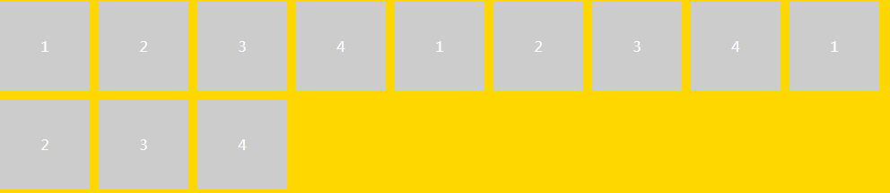
這是換行的效果,其他效果可以嘗試;
2.3 flex-flow 是flex-direction 和 flex-wrap的縮寫;所以當獨寫上面的要寫兩個
默認值為row norap
  .box{
       flex-flow: flex-direction || flex-wrap
      }
2.4 justify-content 屬性定義了項目在主軸上的對齊方式
 .box{
            justify-content:flex-start | flex-end | center | space-between | space-around;
        }
        flex-start(默認值):左對齊
        flex-end:右對齊
        center: 居中
        space-between:兩端對齊,項目之間的間隔都相等。
        space-around:每個項目兩側的間隔相等。所以,項目之間的間隔比項目與邊框的間隔大一倍。
試一種效果:
html5代碼:
 <div class="box2">
          <div class="box-item">1</div>
          <div class="box-item">2</div>
          <div class="box-item">3</div>
          <div class="box-item">4</div>
          <div class="box-item">1</div>
          <div class="box-item">2</div>
          <div class="box-item">3</div>
          <div class="box-item">4</div>
    </div>
css3代碼:
 .box2{
             background: gold;
             margin: 1px;
             display: flex;
             justify-content: center; /**可以換換其他的屬性值*/
         }
         .box-item{
             width: 100px;
             height: 100px;
             line-height: 100px;
             background: #ccc;
             color: white;
             text-align: center;
             margin: 5px;
         }
效果圖:

其他的可以自己試試:
        flex-start(默認值):左對齊
        flex-end:右對齊
        center: 居中
        space-between:兩端對齊,項目之間的間隔都相等。
        space-around:每個項目兩側的間隔相等。所以,項目之間的間隔比項目與邊框的間隔大一倍。
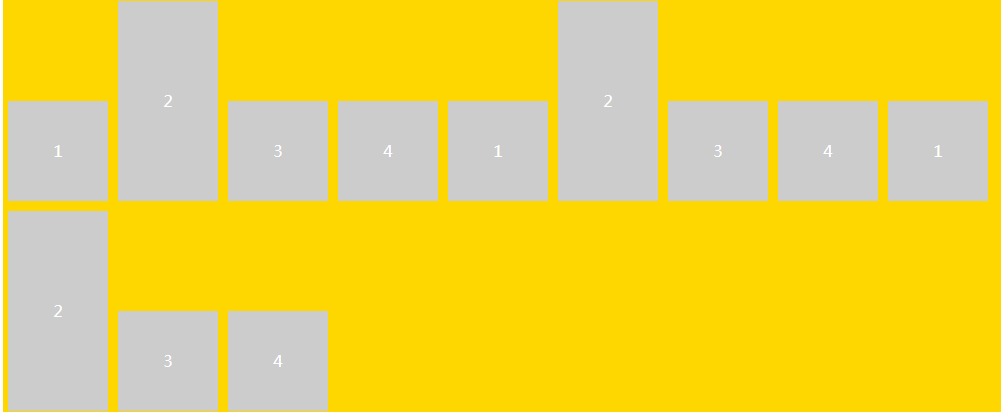
2.5 align-items 定義項目在交叉軸上如何對齊(縱軸)
 .box{
           align-items:flex-start | flex-end |center | baseline |stretch
       }
html5代碼:
 <div class="box3">
          <div class="box-item">1</div>
          <div class="box-item item-tall">2</div>
          <div class="box-item">3</div>
          <div class="box-item">4</div>
          <div class="box-item">1</div>
          <div class="box-item item-tall">2</div>
          <div class="box-item">3</div>
          <div class="box-item">4</div>
          <div class="box-item">1</div>
          <div class="box-item item-tall">2</div>
          <div class="box-item">3</div>
          <div class="box-item">4</div>
    </div>
css3代碼:
   .box3{
             background: gold;
             margin: 1px;
             display: flex;
             align-items:flex-end; /*可以換其他值看看*/
             flex-wrap: wrap;
         }
         .box-item{
             width: 100px;
             height: 100px;
             line-height: 100px;
             background: #ccc;
             color: white;
             text-align: center;
             margin: 5px;
         }
         .item-tall{
             height: 200px; /*交叉軸,高度不一*/
             line-height: 200px;
         }
效果:

其他的可以自己試試:
        flex-start:交叉軸的起點對齊。
        flex-end:交叉軸的終點對齊。
        center:交叉軸的中點對齊。
        baseline: 項目的第一行文字的基線對齊。
        stretch(默認值):如果項目未設置高度或設為auto,將占滿整個容器的高度。
2.6 align-content 屬性定義了多根軸線(多行)的對齊方式,如果項目只有一根軸線,該屬性起不來作用
 .box {
          align-content: flex-start | flex-end | center | space-between | space-around | stretch;
        }
html代碼:
  <div class="box3 box3-tall">
          <div class="box-item">1</div>
          <div class="box-item">2</div>
          <div class="box-item">3</div>
          <div class="box-item">4</div>
          <div class="box-item">1</div>
          <div class="box-item">2</div>
          <div class="box-item">3</div>
          <div class="box-item">4</div>
          <div class="box-item">1</div>
          <div class="box-item">2</div>
          <div class="box-item">3</div>
          <div class="box-item">4</div>
    </div>
css代碼:
   .box3{
             background: gold;
             margin: 1px;
             display: flex;
             flex-wrap: wrap;
             align-content: space-around;
         }
         .box-tall {
             height: 300px;
             }
         .box-item{
             width: 100px;
             height: 100px;
             line-height: 100px;
             background: #ccc;
             color: white;
             text-align: center;
             margin: 5px;
         }
效果:
其他的可以自己試試:
        flex-start:與交叉軸的起點對齊。
        flex-end:與交叉軸的終點對齊。
        center:與交叉軸的中點對齊。
        space-between:與交叉軸兩端對齊,軸線之間的間隔平均分布。
        space-around:每根軸線兩側的間隔都相等。所以,軸線之間的間隔比軸線與邊框的間隔大一倍。
        stretch(默認值):軸線占滿整個交叉軸。
3.容器里子元素的屬性
order屬性定義項目的排列順序。數值越小,排列越靠前,默認為0。 flex-grow屬性定義項目的放大比例,默認為0,即如果存在剩余空間,也不放大。 flex-shrink屬性定義了項目的縮小比例,默認為1,即如果空間不足,該項目將縮小。 flex-basis屬性定義了在分配多余空間之前,項目占據的主軸空間(main size)。瀏覽器根據這個屬性,計算主軸是否有多余空間。它的默認值為auto,即項目的本來大小。align-self屬性允許單個項目有與其他項目不一樣的對齊方式,可覆蓋align-items屬性。默認值為auto,表示繼承父元素的align-items屬性,如果沒有父元素,則等同于stretch
通常我們定義flex:1;
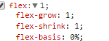
表示的就是這三個;
3.1 order 屬性
html代碼:
<div class="box4">
          <div class="box-item1 ">1</div>
          <div class="box-item1 order">2</div>        /*注意是第二個元素有Order類*/
    </div>
css代碼:
 .box4{
             background: gold;
             margin: 1px;
             display: flex;
         }
         .box-item1{
            flex: 1;
             line-height: 100px;
             background: #ccc;
             color: white;
             text-align: center;
             margin: 5px;

         }
         .order{
             background: blue;
             order: -1;
         }
效果圖:

如果我這樣設置:
 .order{
             background: blue;
             order: -1;
            flex-grow:2; /*多了這個*/
         }

其他的去試一試,大概就是這樣

 浙公網安備 33010602011771號