css多欄自適應布局
css多欄自適應布局還是需要總結一下的,都是基本功。
一般使用position屬性布局,或者用float屬性布局,也可以使用display屬性。
看資料說position適合首頁布局,因為首頁內容往往可以完全控制。float適合模板布局,模板中填充的內容無法控制。
一、左側尺寸固定右側自適應
1、浮動實現
在css浮動一文已介紹過。
 .left{
    width: 150px; float: left;
  }
  /*流體布局*/
.right { margin-left: 150px;}
原理:左側定寬浮動,右側使用margin-left,且不要定寬,容器尺寸變化右側可自適應


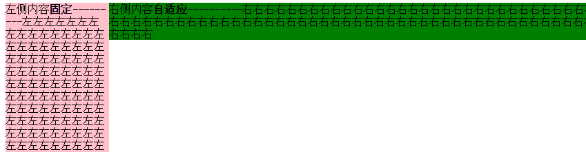
<!DOCTYPE html>
<meta charset="utf-8"/>
<html>
<head>
    <title></title>
    <style type="text/css">
.left {
    width: 150px;
    float: left;
    background-color: pink;
}

/*流體布局*/
.right {
    margin-left: 150px;
    background-color: green;
}
  </style>
</head>
<body>
    <div class="left">
        左側內容固定---------左左左左左左左左左左左左左左左左左左左左左左左左左左左左左左左左左左左左左左左左左左左左左左左左左左左左左左左左左左左左左左左左左左左左左左左左左左左左左左左左左左左左左左左左左左左左左左左左左左左
    </div>
    <div class="right">
        右側內容自適應----------右右右右右右右右右右右右右右右右右右右右右右右右右右右右右右右右右右右右右右右右右右右右右右右右右右右右右右右右右右右右右右右右右右右右右右右右右右右右右右右右右右右右右右右右右右右右右右右右右右
    </div>
</body>
</html>

2、絕對定位實現
.container{width: 100%;position: relative;padding-left: 150px;}
.left {width: 150px;position: absolute;left: 0;}
/*流體布局*/
.right {width: 100%;}
原理:重點是container設置padding-left給left騰出空間,left相對于containr絕對定位,right占滿剩余空間。
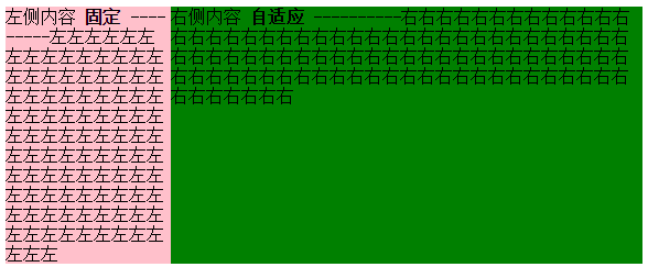
<!DOCTYPE html>
<meta charset="utf-8"/>
<html>
<head>
    <title>2 columns layout of starof</title>
<style type="text/css">
.container {
    width: 100%;
    position: relative;
    padding-left: 150px;
}
.left {
    width: 150px;
    position: absolute;
    left: 0;
    background-color: pink;
}

/*流體布局*/
.right {
    width: 100%;
    background-color: green;
}
</style>
</head>
<body>
    <div class="container">
        <div class="left">
            左側內容 <strong>固定</strong>
            ---------左左左左左左左左左左左左左左左左左左左左左左左左左左左左左左左左左左左左左左左左左左左左左左左左左左左左左左左左左左左左左左左左左左左左左左左左左左左左左左左左左左左左左左左左左左左左左左左左左左左
        </div>
        <div class="right">
            右側內容 <strong>自適應</strong>
            ----------右右右右右右右右右右右右右右右右右右右右右右右右右右右右右右右右右右右右右右右右右右右右右右右右右右右右右右右右右右右右右右右右右右右右右右右右右右右右右右右右右右右右右右右右右右右右右右右右右右
        </div>
    </div>
</body>
</html>
3、BFC實現
.left {width: 150px;float: left;}
.right {display: table-cell;}
原理:左欄定寬浮動,右欄生成BFC,根據BFC特性,與浮動元素相鄰的,創建了BFC的元素,都不能與浮動元素相互覆蓋。
<!DOCTYPE html>
<meta charset="utf-8"/>
<html>
<head>
    <title>2 columns layout of starof</title>
<style type="text/css">
.left {
    width: 150px;
    float: left;
    background-color: pink;
}

/*流體布局*/
.right {
    display: table-cell;
    background-color: green;
}
</style>
</head>
<body>
        <div class="left">
            左側內容 <strong>固定</strong>
            ---------左左左左左左左左左左左左左左左左左左左左左左左左左左左左左左左左左左左左左左左左左左左左左左左左左左左左左左左左左左左左左左左左左左左左左左左左左左左左左左左左左左左左左左左左左左左左左左左左左左左
        </div>
        <div class="right">
            右側內容 <strong>自適應</strong>
            ----------右右右右右右右右右右右右右右右右右右右右右右右右右右右右右右右右右右右右右右右右右右右右右右右右右右右右右右右右右右右右右右右右右右右右右右右右右右右右右右右右右右右右右右右右右右右右右右右右右右
        </div>
</body>
</html>
效果同上。
4、table實現
.container {width: 100%;display: table;}
.left {width: 150px;display: table-cell;}
.right {display: table-cell;}
原理:不說了。
<!DOCTYPE html>
<meta charset="utf-8"/>
<html>
<head>
    <title>2 columns layout of starof</title>
<style type="text/css">
.container {
    width: 100%;
    display: table;
}
.left {
    width: 150px;
    display: table-cell;
    background-color: pink;
}
.right {
    display: table-cell;
    background-color: green;
}
</style>
</head>
<body>
    <div class="container">
        <div class="left">
            左側內容 <strong>固定</strong>
            ---------左左左左左左左左左左左左左左左左左左左左左左左左左左左左左左左左左左左左左左左左左左左左左左左左左左左左左左左左左左左左左左左左左左左左左左左左左左左左左左左左左左左左左左左左左左左左左左左左左左左
        </div>
        <div class="right">
            右側內容 <strong>自適應</strong>
            ----------右右右右右右右右右右右右右右右右右右右右右右右右右右右右右右右右右右右右右右右右右右右右右右右右右右右右右右右右右右右右右右右右右右右右右右右右右右右右右右右右右右右右右右右右右右右右右右右右右右
        </div>
    </div>
</body>
</html>
二、 右側尺寸固定,左側自適應的流體布局
1、不改變DOM位置的寫法【用的比較多】
在css浮動一文已介紹過。
.wrap {
    width: 100%;
    float: left;
    background-color: green;
}
.left {
    margin-right: 150px;
}
.right {
    width: 150px;
    float: left;
    margin-left: -150px;
    background-color: pink;
}
原理:給left包裹一層wrap,wrap用來布局,left調整內容。
wrap和right都左浮動,這樣right會超過視口,通過設置margin-left負值拉回。
此時right回到窗口,但會覆蓋wrap內容。left就派上用場了,left設置margin-right將內容拉回。此時布局和內容都達到目的,完成!
<!DOCTYPE html>
<meta charset="utf-8"/>
<html>
<head>
    <title></title>
<style type="text/css">
.wrap {
    width: 100%;
    float: left;
    background-color: green;
}
.left {
    margin-right: 150px;
}
.right {
    width: 150px;
    float: left;
    margin-left: -150px;
    background-color: pink;
}
</style>
</head>
<body>
    <div class="wrap">
        <div class="left">
            左側內容 <strong>自適應</strong>
            ---------左左左左左左左左左左左左左左左左左左左左左左左左左左左左左左左左左左左左左左左左左左左左左左左左左左左左左左左左左左左左左左左左左左左左左左左左左左左左左左左左左左左左左左左左左左左左左左左左左左左
        </div>
    </div>
    <div class="right">
        右側內容 <strong>固定</strong>
        ----------右右右右右右右右右右右右右右右右右右右右右右右右右右右右右右右右右右右右右右右右右右右右右右右右右右右右右右右右右右右右右右右右右右右右右右右右右右右右右右右右右右右右右右右右右右右右右右右右右右
    </div>
</body>
</html>
2、改變DOM位置的寫法
在css浮動一文已介紹過。
.right{
float: right;
width: 150px;
}
.left{
margin-right: 150px;
}
原理:因為右邊先渲染,右邊右浮動,左邊設margin-right即可。
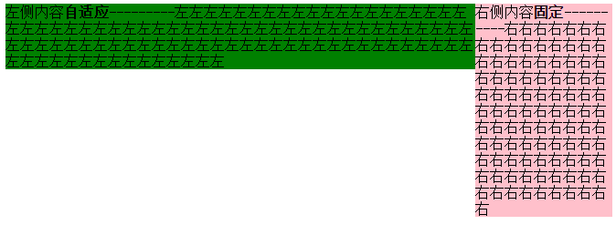
<!DOCTYPE html>
<meta charset="utf-8"/>
<html>
<head>
    <title>2 columns layout of starof</title>
    <style type="text/css">
.left {
    margin-right: 150px;
    background-color: green;
}

.right {
    width: 150px;
    float: right;
    background-color: pink;
}
</style>
</head>
<body>
    <div class="right">
        右側內容 <strong>固定</strong>
        ----------右右右右右右右右右右右右右右右右右右右右右右右右右右右右右右右右右右右右右右右右右右右右右右右右右右右右右右右右右右右右右右右右右右右右右右右右右右右右右右右右右右右右右右右右右右右右右右右右右右
    </div>
    <div class="left">
        左側內容 <strong>自適應</strong>
        ---------左左左左左左左左左左左左左左左左左左左左左左左左左左左左左左左左左左左左左左左左左左左左左左左左左左左左左左左左左左左左左左左左左左左左左左左左左左左左左左左左左左左左左左左左左左左左左左左左左左左
    </div>

</body>
</html>

三、左右都自適應
在css浮動一文已介紹過。
.left {float: left;}
.right{display: table-cell;}
原理:左欄左浮動,右欄生成BFC,根據BFC特性:與浮動元素相鄰的、創建了BFC的元素,都不能與浮動元素相互覆蓋。
<!DOCTYPE html>
<meta charset="utf-8"/>
<html>
<head>
    <title>2 columns layout of starof</title>
    <style type="text/css">
.left {
    float: left;
    background-color: green;
}
img{
    width: 100px;
    height: 100px;
}
.right {
    display: table-cell;
    background-color: pink;
}
</style>
</head>
<body>
    <div class="left">
        <img src="img/sheep.png"></div>
    <div class="right">
        右側內容 <strong>自適應</strong>
        ----------右右右右右右右右右右右右右右右右右右右右右右右右右右右右右右右右右右右右右右右右右右右右右右右右右右右右右右右右右右右右右右右右右右右右右右右右右右右右右右右右右右右右右右右右右右右右右右右右右右
    </div>
</body>
</html>
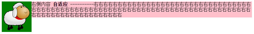
缺點:由于IE6并不支持display:table-cell,用css hack彌補,右側設定overflow:auto;zoom:1或者overflow:hidden;zoom:1。
.right{ display:table-cell;_display:block;zoom:1;}
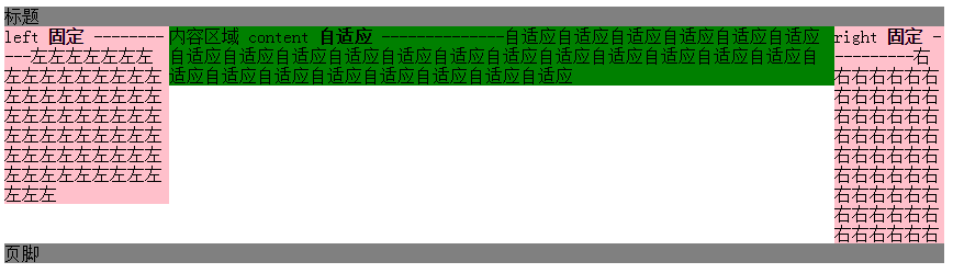
應用案例:紅色框部分,兩欄自適應,左右都不定寬,右側欄數量不定。
四、三欄布局,左右定寬,中間內容自適應【update20170422】
1、左右float+中間margin實現
.left {width: 150px;float: left;}
.right {width: 100px;float: right;}
.content {margin-right: 100px;margin-left: 150px;}
.footer {clear: both;}
原理:用float實現。
左邊定寬左浮動,右邊定寬右浮動,中間margin調整左右間距,底部清除浮動。
Note:left和right的html代碼寫在content之前,先渲染。
<!DOCTYPE>
<html>
<meta charset="utf-8"/>
<head>
    <title>3 columns layout of starof</title>
    <style type="text/css">
        .header {
            background-color: gray;
        }

        .left {
            background-color: pink;
            width: 150px;
            float: left;
        }

        .right {
            background-color: pink;
            float: right;
            width: 100px;
        }

        .content {
            background-color: green;
            margin-right: 100px;
            margin-left: 150px;
        }

        .footer {
            background-color: grey;
            clear: both;
        }
    </style>
</head>
<body>
<div id="page">
    <div class="header">
        標題
    </div>
    <div class="left">
        left <strong>固定</strong>
        -----------左左左左左左左左左左左左左左左左左左左左左左左左左左左左左左左左左左左左左左左左左左左左左左左左左左左左左左左左左左左左左左左左
    </div>
    <div class="right">
        right <strong>固定</strong>
        ----------右右右右右右右右右右右右右右右右右右右右右右右右右右右右右右右右右右右右右右右右右右右右右右右右右右右右右右右
    </div>

    <div class="content">
        內容區域
        content
        <strong>自適應</strong>
        --------------自適應自適應自適應自適應自適應自適應自適應自適應自適應自適應自適應自適應自適應自適應自適應自適應自適應自適應自適應自適應自適應自適應自適應自適應自適應自適應
    </div>
    <div class="footer">
        <p>頁腳</P>
    </div>
</div>
</body>
</html>
缺點:
DOM順序和視覺順序不同,關鍵的主體內容在文檔后面,主次不合理。如果右欄包含大量腳本資源,可能影響甚至阻塞整個頁面的載入。不適合用做整站頁面框架的搭建。
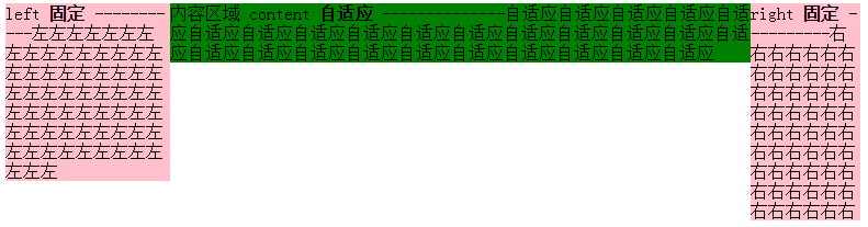
2、左右絕對定位+margin
原理:左右絕對定位,中間margin:0 100px 0 150px;
<!DOCTYPE>
<html>
<meta charset="utf-8"/>
<head>
    <title>3 columns layout of starof</title>
    <style type="text/css">
        .page{
            position: relative;
        }
        .left {
            background-color: pink;
            width: 150px;
            position: absolute;
            left: 0;
            top:0;
        }

        .right {
            background-color: pink;
            position: absolute;
            right:0;
            top: 0;
            width: 100px;
        }

        .content {
            background-color: green;
            margin-right: 100px;
            margin-left: 150px;
        }
    </style>
</head>
<body>
<div class="page">
    <div class="left">
        left <strong>固定</strong>
        -----------左左左左左左左左左左左左左左左左左左左左左左左左左左左左左左左左左左左左左左左左左左左左左左左左左左左左左左左左左左左左左左左左
    </div>
    <div class="content">
        內容區域
        content
        <strong>自適應</strong>
        --------------自適應自適應自適應自適應自適應自適應自適應自適應自適應自適應自適應自適應自適應自適應自適應自適應自適應自適應自適應自適應自適應自適應自適應自適應自適應自適應
    </div>
    <div class="right">
        right <strong>固定</strong>
        ----------右右右右右右右右右右右右右右右右右右右右右右右右右右右右右右右右右右右右右右右右右右右右右右右右右右右右右右右
    </div>
</div>
</body>
</html>
3、左中右全部浮動+左右margin-left負值
重點是content 右2層標簽,外層content布局,內層body內容展示。content,right,content都左浮動。content100%寬度,left設置margin-left:-100%,由于前面的content寬度100%于瀏覽器,所以這里的-100%margin值正好使左欄div定位到了頁面的左側,right設置margin-left:-100px;content里面加一層body為內容主體,設置margin:0 100px 0 150px;
<!DOCTYPE>
<html>
<meta charset="utf-8"/>
<head>
    <title>3 columns layout of starof</title>
    <style type="text/css">
        .content, .left, .right {
            float: left;
        }

        .left {
            background-color: pink;
            width: 150px;
            margin-left: -100%;
        }

        .right {
            background-color: pink;
            width: 100px;
            margin-left: -100px;
        }

        .content {
            width: 100%;
            background-color: green;
        }

        .body {
            margin-left: 150px;
            margin-right: 100px;
        }
    </style>
</head>
<body>
<div class="content">
    <div class="body">
        <div style="width:100px;height: 100px;border:1px solid red"></div>
        內容區域
        content
        <strong>自適應</strong>
        --------------自適應自適應自適應自適應自適應自適應自適應自適應自適應自適應自適應自適應自適應自適應自適應自適應自適應自適應自適應自適應自適應自適應自適應自適應自適應自適應
    </div>
</div>
<div class="left">
    left <strong>固定</strong>
    -----------左左左左左左左左左左左左左左左左左左左左左左左左左左左左左左左左左左左左左左左左左左左左左左左左左左左左左左左左左左左左左左左左
</div>
<div class="right">
    right <strong>固定</strong>
    ----------右右右右右右右右右右右右右右右右右右右右右右右右右右右右右右右右右右右右右右右右右右右右右右右右右右右右右右右
</div>

</body>
</html>
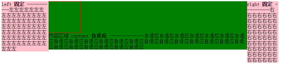
content結構在left和right前面。
4、float+負margin實現
原理:分而治之,多封裝一層,兩兩處理。
原理簡單,處理起來稍復雜,我分步說明。
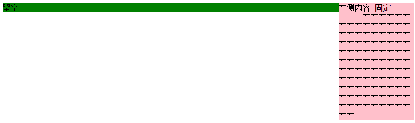
步驟一:先處理好right布局,wrap和right都左浮動,即應用上面【右側尺寸固定,左側自適應的流體布局】的第一種方法。
<!DOCTYPE html>
<meta charset="utf-8"/>
<html>
<head>
    <title></title>
<style type="text/css">
.wrap {
    width: 100%;
    float: left;
    background-color: green;
}
.leftwrap {
    margin-right: 150px;
}
.right {
    width: 150px;
    float: left;
    margin-left: -150px;
    background-color: pink;
}
</style>
</head>
<body>
    <div class="wrap">
        <div class="leftwrap">
            留空
        </div>
    </div>
    <div class="right">
        右側內容 <strong>固定</strong>
        ----------右右右右右右右右右右右右右右右右右右右右右右右右右右右右右右右右右右右右右右右右右右右右右右右右右右右右右右右右右右右右右右右右右右右右右右右右右右右右右右右右右右右右右右右右右右右右右右右右右右
    </div>
</body>
</html>
目前的效果是這樣:
將左邊leftwrap留空部分補上下面結構
<div class="contentwrap">
    <div class="content">主體部分</div>
</div>
<div class="left">左側欄</div>
步驟二:再處理left和content布局,contentwrap右浮動,left左浮動,完成。
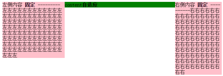
<!DOCTYPE html>
<meta charset="utf-8"/>
<html>
<head>
    <title>3 columns layout of starof</title>
<style type="text/css">
/*步驟一:先處理好right布局,wrap和right都右浮動*/
.wrap { width: 100%; float: left; } /*wrap控制布局*/
.leftwrap { margin-right: 150px; }/*leftwrap控制內容*/
.right { width: 150px; float: left; margin-left: -150px; background-color: pink; }
/*步驟二:再處理left和content布局,contentwrap右浮動,left左浮動*/
.contentwrap { float: right; width: 100%; }/*contentwrap控制主體內容布局*/
.left { float: left; width: 200px; margin-right: -200px; background-color: pink; }
.content { margin-left: 200px; background-color: green; }/*content控制主體內容*/
</style>
</head>
<body>
    <div class="wrap">
        <div class="leftwrap">
            <div class="contentwrap">
                <div class="content">content<strong>自適應</strong></div>
            </div>
            <div class="left">
            左側內容 <strong>固定</strong>
            ---------左左左左左左左左左左左左左左左左左左左左左左左左左左左左左左左左左左左左左左左左左左左左左左左左左左左左左左左左左左左左左左左左左左左左左左左左左左左左左左左左左左左左左左左左左左左左左左左左左左左</div>
        </div>
    </div>
    <div class="right">
        右側內容 <strong>固定</strong>
        ----------右右右右右右右右右右右右右右右右右右右右右右右右右右右右右右右右右右右右右右右右右右右右右右右右右右右右右右右右右右右右右右右右右右右右右右右右右右右右右右右右右右右右右右右右右右右右右右右右右右
    </div>
</body>
</html>
缺點:嵌套多層標簽,html文檔不夠簡潔。
總結:如果不是必要,浮動布局不要輕易定寬高,盡量自適應。
資源鏈接:
基于CSS3的自適應布局技術
https://github.com/RubyLouvre/myless/issues/2
本文作者starof,因知識本身在變化,作者也在不斷學習成長,文章內容也不定時更新,為避免誤導讀者,方便追根溯源,請諸位轉載注明出處:http://www.rzrgm.cn/starof/p/4744392.html有問題歡迎與我討論,共同進步。
如果覺得本文對您有幫助~可以微信支持一下:


 浙公網安備 33010602011771號