
getting started with transformjs
2016-11-26 16:31 【當耐特】 閱讀(1034) 評論(0) 收藏 舉報Introduction
In the past two years, more and more friends for mobile web development have used the transformjs. I will introduce it in order to allow more people to benefit, improve programming efficiency, and enjoy the programming fun. (of course, transformjs not only supports mobile devices, supports 3D Transforms CSS3 browser can normally use transformjs)
Doorway
Home Page:http://alloyteam.github.io/AlloyTouch/transformjs/
Github :https://github.com/AlloyTeam/AlloyTouch/tree/master/transformjs
Install
npm install css3transform
API
Transform(domElement, [notPerspective]);
Through the above a line of code calls, you can set or get the domElement's "translateX", "translateY", "translateZ", "scaleX", "scaleY", "scaleZ", "rotateX", "rotateY", "rotateZ", "skewX", "skewY", "originX", "originY", "originZ"!
So easy!
Usage
Transform(domElement);//or Transform(domElement, true);

//set "translateX", "translateY", "translateZ", "scaleX", "scaleY", "scaleZ", "rotateX", "rotateY", "rotateZ", "skewX", "skewY", "originX", "originY", "originZ"
domElement.translateX = 100;
domElement.scaleX = 0.5;
domElement.originX = 50;

//get "translateX", "translateY", "translateZ", "scaleX", "scaleY", "scaleZ", "rotateX", "rotateY", "rotateZ", "skewX", "skewY", "originX", "originY", "originZ"
console.log(domElement.translateX )
CSS3 programming problems
Previously, we generally use zepto/jQuery's animate method, animate.css or tween.js+css3 to develop the interactive effects. There are three drawbacks:
- not intuitive
- not directly
- not convenient
not intuitive
Look at the picture below:
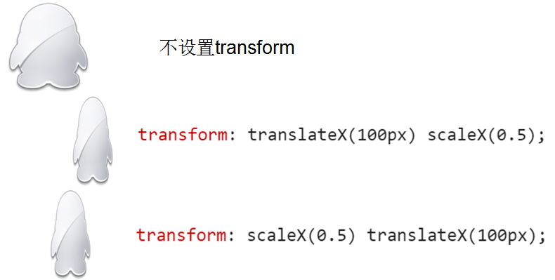
The order will affect the results,not intuitive. why is this the result? compare the final matrixs by new WebKitCSSMatrix(transform_str).
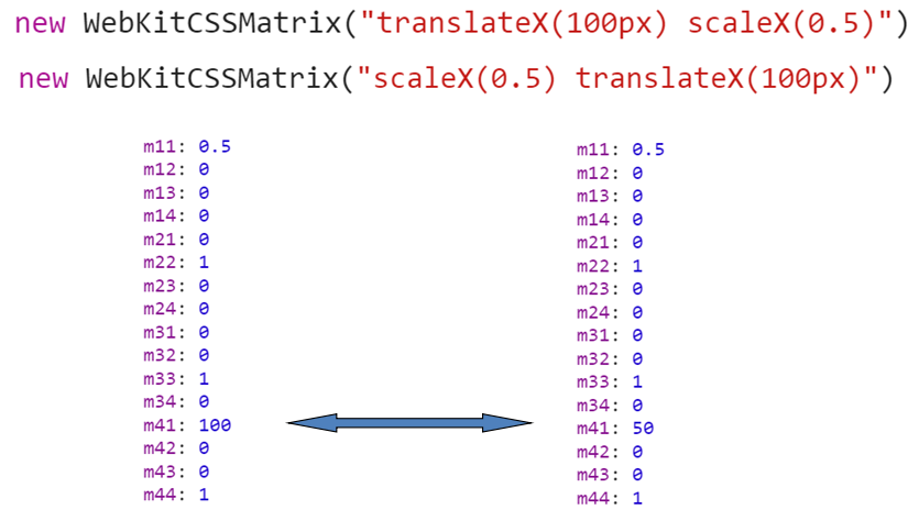
It also directly shows that the matrix does not conform to the switching law.AB!=BA
Not directly
zepto:
$("#some_element").animate({
  opacity: 0.25, left: '50px',
  color: '#abcdef',
  rotateZ: '45deg', translate3d: '0,10px,0'
}, 500, 'ease-out')
translate3d: '0,10px,0' is very inconvenient, can not step progressive descending control. Not to mention with some time library to program. Can you argue that'ease-out'doesn't make it ? But if I need to make X and y, and Z, respectively, corresponding to different easing function, which is based on the form of a string of programming in the form of hard
Here also need to pay attention to is that the order in the zepto will also affect the results.
tween.js
var position = { x: 100, y: 100, rotation: 0 },
    target = document.getElementById('target');

    new TWEEN.Tween(position)
    .to({ x: 700, y: 200, rotation: 359 }, 2000)
    .delay(1000)
    .easing(TWEEN.Easing.Elastic.InOut)
    .onUpdate(function update() {
        var t_str= 'translateX(' + position.x + 'px) translateY(' + position.y + 'px) rotate(' + Math.floor(position.rotation) + 'deg)';
        element.style.transform = element.style.msTransform = element.style.OTransform = element.style.MozTransform = element.style.webkitTransform = t_str;
    });
The way to use a string is too hard.
animate.css
@keyframes pulse {
  from {
    -webkit-transform: scale3d(1, 1, 1);
    transform: scale3d(1, 1, 1);
  }

  50% {
    -webkit-transform: scale3d(1.05, 1.05, 1.05);
    transform: scale3d(1.05, 1.05, 1.05);
  }

  to {
    -webkit-transform: scale3d(1, 1, 1);
    transform: scale3d(1, 1, 1);
  }
}
Animate.css package a lot of key frame animation, developers only need to add or remove the relevant animation class . This to some extent to the interaction effects brought great traversal, but have a mishap:
- the programming is not high enough.
- apply to simple scenes
- no change callback, only end callback
Not convenient
The rotation point of the transform is the default point in the center, but some of the time, not in the center of the system, our traditional approach is to use transform-origin to set the benchmark.
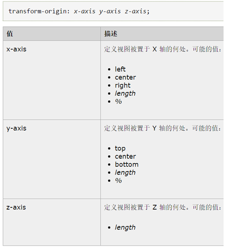
Note that it is another attribute transform-origin, not transform. But what if you need to exercise transform-origin? This design is not on the waste? There is no need to animate the origin ? This is the game design is often used to, this is the beginning of another separate say, the fact is that there is a scene is the need to animate origin to achieve some kind of effect.
transformjs
Based on the above all kinds of inconvenience, so start to use transformjs!
- transformjs as one of the Tencent AlloyTeam mobile development tool, widely used in hand Web Q, WeChat Web related business development
- transformjs focuses on transform CSS3 to read and set up an ultra lightweight JS library, which greatly improves the transform CSS3's programmable
- transformjs is highly abstract, and is not tied to any time framework, so it can be easily used with any time, and with a moving frameworld.
- transformjs uses the matrix3d as the final output to the DOM object,it has hardware acceleration and not losing the programmable
- transformjs has super easy API, one minute to easily get started, two minutes to embed real project combat
- transformjs extends the ability of the transform itself, right!it's originX, originY and originZ!
Start using it:
Home Page:http://alloyteam.github.io/AlloyTouch/transformjs/
Github :https://github.com/AlloyTeam/AlloyTouch/tree/master/transformjs

 浙公網安備 33010602011771號