CSS實現(xiàn)扇形圓形 的一種思路
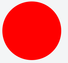
第一步 CSS畫圓
思路:先實現(xiàn)正方形,通過設置四個圓角來實現(xiàn)圓形,圓角大小為正方形邊長的1/2
1 <div class="circle"></div>
2 <style>
3   .circle {
4       width: 200px;
5       height: 200px;
6       border-radius: 100px;
7       background-color: #f00;
8   }
9 </style>
第二步 CSS畫半圓
思路:
1. 通過設置兩個圓角來實現(xiàn)半圓先畫整圓
2.通過clip設置可見區(qū)域為1/2
 1 <div class="semi"></div>
 2 <div class="semi-clip"></div>
 3 <style>
 4   .semi {
 5       width: 200px;
 6       height: 100px;
 7       border-radius: 100px 100px 0 0;
 8       background-color: #f00;
 9   }
10   .semi-clip {
11       position: absolute;
12       width: 200px;
13       height: 200px;
14       border-radius: 100px;
15       background-color: #f00;
16       clip: rect(0 200px 200px 100px);
17   }
18 </style>

第三步 CSS實現(xiàn)90度扇形
思路:
1. 通過設置一個圓角來實現(xiàn)90度扇形
2.通過設置正方形的一個border來實現(xiàn)90度扇形
 1 <div class="quarter"></div>
 2 <div class="quarter-border"></div>
 3 <style>
 4   .quarter {
 5       width: 100px;
 6       height: 100px;
 7       border-radius: 100px 0 0;
 8       background-color: #f00;
 9   }
10   .quarter-border {
11       width: 200px;
12       height: 200px;
13       border: 100px solid #fff;
14       border-right-color: #f00;
15       box-sizing: border-box;
16       border-radius: 100px;
17   }
18 </style>
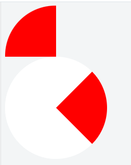
第四步 CSS實現(xiàn)任意角度扇形
小于180度扇形
思路一:整圓紅底,兩個白底半圓各自蓋住整圓的一半,通過旋轉其中一個半圓實現(xiàn)任意角度
 1 <div class="circle">
 2   <div class="semi semi1"></div>
 3   <div class="semi semi2"></div>
 4 </div>
 5 <style>
 6     .circle {
 7         width: 200px;
 8         height: 200px;
 9         border-radius: 100px;
10         background-color: #f00;
11         position: relative;
12     }
13     .semi {
14         background-color: #fff;
15         position: absolute;
16         width: 200px;
17         height: 200px;
18     }
19     .semi1 {
20         clip: rect(0 200px 200px 100px);
21         transform: rotate(65deg);
22     }
23     .semi2 {
24         clip: rect(0 100px 200px 0);
25     }
26 </style>

思路2:整圓白底,兩個半圓(紅底、白底各一個)重疊,紅底在下,白底在上,通過旋轉白底半圓實現(xiàn)任意角度
 1 <div class="circle">
 2   <div class="semi semi1"></div>
 3   <div class="semi semi2"></div>
 4 </div>
 5 <style>
 6     .circle {
 7         width: 200px;
 8         height: 200px;
 9         border-radius: 100px;
10         background-color: #fff;
11         position: relative;
12     }
13     .semi {
14         background-color: #f00;
15         position: absolute;
16         width: 200px;
17         height: 200px;
18         clip: rect(0 200px 200px 100px);
19     }
20     .semi2 {
21         background-color: #fff;
22         transform: rotate(65deg);
23     }
24 </style>

思路3:先畫白底半圓,內(nèi)部嵌套紅底半圓,但是內(nèi)部半圓在不可見區(qū)域,通過逐步旋轉紅底半圓到可見區(qū)域來實現(xiàn)任意角度
 1 <div class="circle">
 2     <div class="semi semi1">
 3         <div class="inner"></div>
 4     </div>
 5 </div>
 6 <style>
 7     .circle {
 8         width: 200px;
 9         height: 200px;
10         border-radius: 100px;
11         position: relative;
12     }
13     .semi {
14         position: absolute;
15         width: 200px;
16         height: 200px;
17         border-radius: 100px;
18         background-color: #fff;
19         clip: rect(0 200px 200px 100px);
20     }
21     .semi .inner {
22         position: absolute;
23         width: 200px;
24         height: 200px;
25         border-radius: 100px;
26         background-color: #f00;
27         clip: rect(0 100px 200px 0);
28     }
29     .semi1 .inner {
30         transform: rotate(65deg);
31     }
32 </style>

大于180度扇形 思路:半圓+小于180度扇形
 1 <div class="circle">
 2   <div class="semi semi1"></div>
 3   <div class="semi semi2"></div>
 4 </div>
 5 <style>
 6     .circle {
 7         width: 200px;
 8         height: 200px;
 9         border-radius: 100px;
10         background-color: #fff;
11         position: relative;
12     }
13     .semi {
14         position: absolute;
15         width: 200px;
16         height: 200px;
17         background-color: #f00;
18         clip: rect(0 200px 200px 100px);
19     }
20     .semi2 {
21         transform: rotate(60deg)
22     }
23 </style>

第五步 完整圓形動畫
思路:第四步中的每種實現(xiàn)方式,小于180度和大于180度不會同時存在。而要實現(xiàn)完整圓形動畫,可以使用兩個小于180度的扇形疊加,其中一個到達180度(動畫結束)后另一個開始。
 1 <div class="circle">
 2     <div class="semi semi1">
 3         <div class="inner"></div>
 4     </div>
 5     <div class="semi semi2">
 6         <div class="inner"></div>
 7     </div>
 8 </div>
 9 <style>
10     .circle {
11         width: 200px;
12         height: 200px;
13         border-radius: 100px;
14         position: relative;
15     }
16     .semi {
17         position: absolute;
18         width: 200px;
19         height: 200px;
20         border-radius: 100px;
21         background-color: #fff;
22         clip: rect(0 200px 200px 100px);
23     }
24     .semi .inner {
25         position: absolute;
26         width: 200px;
27         height: 200px;
28         border-radius: 100px;
29         background-color: #f00;
30         clip: rect(0 100px 200px 0);
31     }
32
33     .semi2 {
34         clip: rect(0 100px 200px 0);
35     }
36     .semi2 .inner {
37         clip: rect(0 200px 200px 100px);
38     }
39     @keyframes sector {
40         from {
41             transform: rotate(0deg)
42         }
43         to {
44             transform: rotate(180deg)
45         }
46     }
47     .semi1 .inner {
48         animation: sector 1s linear 0s forwards;
49     }
50     .semi2 .inner {
51         animation: sector 1s linear 1s forwards;
52     }
53 </style>
 這只是其中的一幀效果圖。
第六步 圓環(huán)
思路:在第五步的基礎上,增加實心白底圓
 1 <!DOCTYPE html>
 2 <html>
 3 <head>
 4     <title>CSS Fan Animation</title>
 5     <style>
 6         .circle {
 7             width: 200px;
 8             height: 200px;
 9             border-radius: 100px;
10             position: relative;
11         }
12
13         .semi {
14             position: absolute;
15             width: 200px;
16             height: 200px;
17             border-radius: 100px;
18             background-color: #fff;
19             clip: rect(0 200px 200px 100px);
20         }
21
22             .semi .inner {
23                 position: absolute;
24                 width: 200px;
25                 height: 200px;
26                 border-radius: 100px;
27                 background-color: #f00;
28                 clip: rect(0 100px 200px 0);
29             }
30
31         .semi2 {
32             clip: rect(0 100px 200px 0);
33         }
34
35             .semi2 .inner {
36                 clip: rect(0 200px 200px 100px);
37             }
38
39         @keyframes sector {
40             from {
41                 transform: rotate(0deg)
42             }
43
44             to {
45                 transform: rotate(180deg)
46             }
47         }
48
49         .semi1 .inner {
50             animation: sector 1s linear 0s forwards;
51         }
52
53         .semi2 .inner {
54             animation: sector 1s linear 1s forwards;
55         }
56
57         .round {
58             position: absolute;
59             top: 10px;
60             left: 10px;
61             width: 180px;
62             height: 180px;
63             border-radius: 50%;
64             background-color: #fff;
65         }
66     </style>
67 </head>
68 <body>
69
70     <div class="circle">
71         <div class="semi semi1">
72             <div class="inner"></div>
73         </div>
74         <div class="semi semi2">
75             <div class="inner"></div>
76         </div>
77         <div class="round">
78
79         </div>
80     </div>
81 </body>
82 </html>
83 <!--
84     思路:
85        <=180度扇形  先畫白底半圓,內(nèi)部嵌套紅底半圓rect實現(xiàn),但是內(nèi)部半圓在不可見區(qū)域rect實現(xiàn),通過逐步旋轉紅底半圓到可見區(qū)域來實現(xiàn)任意角度
86        >180度扇形 半圓+小于180度扇形
87        增加實心白底圓 class="round"
88 -->
 這只是其中的一幀效果圖。
來源:https://mp.weixin.qq.com/s?__biz=MzI4MzA5NTI0NA==&mid=2247483687&idx=1&sn=3fc23f90416e88f3578f024621eeed58&chksm=eb8eb884dcf93192dc4bec3cdfcc6aabd687cf79033e567d076d3d4166e1754d5e0a18f578fd&scene=27


 浙公網(wǎng)安備 33010602011771號