
鴻蒙應用開發從入門到實戰(十七):ArkUI組件List&列表布局
大家好,我是潘Sir,持續分享IT技術,幫你少走彎路。《鴻蒙應用開發從入門到項目實戰》系列文章持續更新中,陸續更新AI+編程、企業級項目實戰等原創內容、歡迎關注!
ArkUI提供了豐富的系統組件,用于制作鴻蒙原生應用APP的UI,本文通過簡單案例演示如何使用List組件實現列表布局。
一、List布局優化商品列表
上一小節里的商品列表,隨著數據增多,當超出界面后,無法滾動查看。List列表布局就可以解決這個問題。
List列表是一種復雜容器,具備下列特點:
-
列表項ListItem數量過多超出屏幕后,會自動提供滾動功能
-
列表項ListItem既可以縱向排列,也可以橫向排列
再pages/layout下新建list目錄,新建ProductList.ets文件,將上一小節里的代碼文件ProductListPage.ets文件里的內容拷貝過來進行修改。
將ForEach部分的內容放到List組件里即可
class Item1 { // 復制過來后,即使再不同的文件中,也會提示同名
  name: string //小寫
  image: ResourceStr
  price: number
  discount: number

  constructor(name: string, image: ResourceStr, price: number, discount: number = 0) {
    this.name = name
    this.image = image
    this.price = price
    this.discount = discount
  }
}

@Entry
@Component
struct ProductList {
  // 商品數據
  private items: Array<Item1> = [
    new Item1('華為Mate60', $r('app.media.mate60'), 6999, 500),
    new Item1('MateBookProX', $r('app.media.mate60'), 13999),
    new Item1('WatchGT4', $r('app.media.mate60'), 1438),
    new Item1('FreeBuds Pro3', $r('app.media.mate60'), 1499),
    new Item1('FreeBuds Pro3', $r('app.media.mate60'), 199),
    new Item1('Mate X5', $r('app.media.mate60'), 12999)
  ]

  build() {
    Column({ space: 8 }) {
      // 標題
      Row() {
        Text('商品列表')
          .fontSize(30)
          .fontWeight(FontWeight.Bold)
      }
      .width('100%')
      // .height(30) //控制高度
      .margin({ bottom: 20 })

      // 商品列表
      List({ space: 8 }) {
        ForEach(
          this.items,
          (item: Item1) => {
            ListItem() {  //ListItem子元素必須用根元素包裹
              Row({ space: 10 }) {
                Image(item.image)
                  .width(100)
                Column({ space: 4 }) {
                  if (item.discount) {
                    Text(item.name)
                      .fontSize(20)
                      .fontWeight(FontWeight.Bold)
                    Text('原價:¥' + item.price)
                      .fontColor('#CCC')
                      .fontSize(14)
                      .decoration({ type: TextDecorationType.LineThrough })
                    Text('折扣價:¥' + (item.price - item.discount))
                      .fontColor('#F36')
                      .fontSize(18)
                    Text('補貼:¥' + item.discount)
                      .fontColor('#F36')
                      .fontSize(18)
                  } else {
                    Text(item.name)
                      .fontSize(20)
                      .fontWeight(FontWeight.Bold)
                    Text('¥' + item.price)
                      .fontColor('#F36')
                      .fontSize(18)
                  }
                }
                .height('100%')
                .alignItems(HorizontalAlign.Start)
              }
              .width('100%')
              .backgroundColor('#FFF')
              .borderRadius(20)
              .height(120)
              .padding(10)
            }
          }
        )
      }
      .width('100%')
      // .layoutWeight(1)
    }
    .width('100%')
    .height('100%')
    .backgroundColor('#EFEFEF')
    .padding(20)
  }
}
這樣,就可以通過拖動呈現超過屏幕區的內容。
二、列表布局詳解
2.1 概述
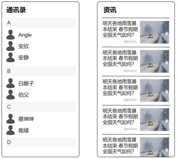
List是一個功能強大的容器組件,使用List可以輕松高效地顯示結構化、可滾動的列表信息,例如通訊錄、新聞列表等等。
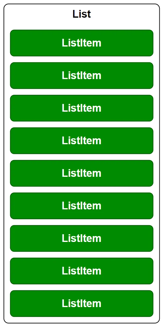
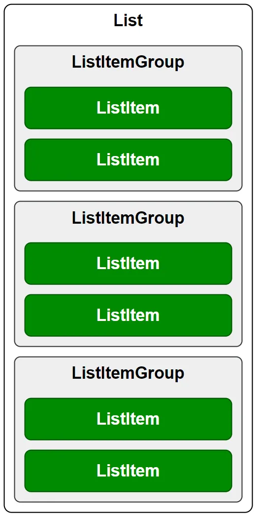
List容器的子組件為ListItem或者ListItemGroup,其中,ListItem表示單個列表項,ListItemGroup用于列表數據的分組展示,其子組件也是ListItem,具體用法如下
List() {
  // 列表項
  ListItem() {......}
  ListItem() {......}
  ListItem() {......}
  ListItem() {......}
  ListItem() {......}
  ListItem() {......}
  ListItem() {......}
  ListItem() {......}
  ListItem() {......}
  ListItem() {......}
  ListItem() {......}
  ListItem() {......}
}
效果
List() {
  // 列表組
  ListItemGroup(){
    //列表項
    ListItem(){......}
    ListItem(){......}
  }

  ListItemGroup(){
    ListItem(){......}
    ListItem(){......}
  }

  ListItemGroup(){
    ListItem(){......}
    ListItem(){......}
  }
}
效果
2.2 參數
List 組件的參數定義如下,下面逐一介紹每個參數
List(value?:{space?: number | string, scroller?: Scroller})
2.2.1 列表項間距
space參數用于設置列表項的間距,如下圖所示

2.2.2 列表滾動控制器
scroller參數用于綁定列表滾動控制器(Scroller),Scroller可以控制列表的滾動,例如令列表返回頂部
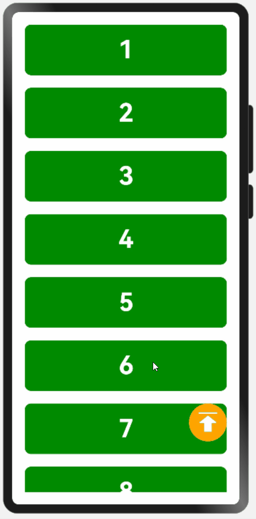
示例:
拷貝icon-top.png到resources/base/media目錄
pages /layout/list新建ScrollerPage.ets
@Entry
@Component
struct ScrollerPage {
  data: number[] = [1, 2, 3, 4, 5, 6, 7, 8, 9, 10, 11, 12, 13, 14, 15]
  scroller: Scroller = new Scroller();

  build() {
    Stack({ alignContent: Alignment.BottomEnd }) {
      List({ space: 20, scroller: this.scroller }) {
        ForEach(this.data, (item) => {
          ListItem() {
            Text(item.toString())
              .itemTextStyle()
          }
        })
      }.listStyle()
      .height('100%')
      .width('100%')

      Button({ type: ButtonType.Circle }) {
        Image($r('app.media.icon_top'))
          .width(40)
          .height(40)
      }
      .width(60)
      .height(60)
      .backgroundColor(Color.Orange)
      .offset({ x: -20, y: -100 })
      .onClick(() => {
        this.scroller.scrollToIndex(0)
      })
    }
  }
}

@Extend(Text) function itemTextStyle() {
  .height(80)
  .width('100%')
  .textAlign(TextAlign.Center)
  .fontColor(Color.White)
  .fontSize(40)
  .fontWeight(FontWeight.Bold)
  .backgroundColor('#008a00')
  .borderRadius(10)
}

@Extend(List) function listStyle() {
  .backgroundColor(Color.White)
  .padding(20)
}
2.3 常用屬性
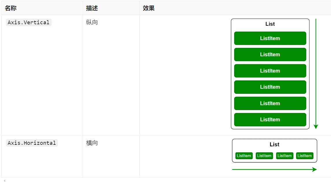
2.3.1 主軸方向
使用listDirection()方法可以設置列表的主軸方向(即列表的排列和滾動方向),其參數類型為枚舉類型Axis,可選的枚舉值如下
2.3.2 交叉軸對齊方式
使用alignListItem()方法可以設置子組件在交叉軸方向的對齊方式,其參數類型為枚舉類型ListItemAlign,可選的枚舉值有

示例代碼
pages /layout/list新建AlignPage.ets
@Entry
@Component
struct AlignPage {
  data: number[] = [1, 2, 3, 4, 5, 6, 7, 8, 9, 10, 11, 12, 13, 14, 15]

  build() {

    List({ space: 20 }) {
      ForEach(this.data, (item) => {
        ListItem() {
          Text(item.toString())
            .height(80)
            .width(320)
            .itemTextStyle1()
        }
      })
    }.listStyle1()
    .height('100%')
    .width('100%')
    .alignListItem(ListItemAlign.Center)

  }
}

@Extend(Text) function itemTextStyle1() {  //同一個命名空間下不能重復,否則會報錯
  .textAlign(TextAlign.Center)
  .fontColor(Color.White)
  .fontSize(40)
  .fontWeight(FontWeight.Bold)
  .backgroundColor('#008a00')
  .borderRadius(10)
}

@Extend(List) function listStyle1() {
  .backgroundColor(Color.White)
  .padding({ top: 20, bottom: 20 })
}
2.3.3 元素分割線
使用divider()屬性可設置列表元素分割線樣式,該方法的參數定義如下
divider(value: {strokeWidth: Length, color?: ResourceColor, startMargin?: Length, endMargin?: Length})
各參數的含義如下
| 參數 | 含義 |
|---|---|
strokeWidth |
分割線線寬 |
color |
分割線顏色 |
startMargin |
分割線起始端到列表側邊距離(如下圖所示) |
endMargin |
分割線末端到列表側邊距離(如下圖所示) |

示例代碼
pages /layout/list新建DividerPage.ets
@Entry
@Component
struct DividerPage {
  data: number[] = [1, 2, 3, 4, 5, 6, 7, 8, 9, 10, 11, 12, 13, 14, 15]

  build() {

    List({ space: 20 }) {
      ForEach(this.data, (item) => {
        ListItem() {
          Text(item.toString())
            .height(80)
            .width(320)
            .itemTextStyle2()
        }
      })
    }
    .listStyle2()
    .height('100%')
    .width('100%')
    .alignListItem(ListItemAlign.Center)
    .divider({
      strokeWidth: 1,
      color: Color.Orange,
      startMargin: 30,
      endMargin: 30
    })

  }
}

@Extend(Text) function itemTextStyle2() {
  .textAlign(TextAlign.Center)
  .fontColor(Color.White)
  .fontSize(40)
  .fontWeight(FontWeight.Bold)
  .backgroundColor('#008a00')
  .borderRadius(10)
}

@Extend(List) function listStyle2() {
  .backgroundColor(Color.White)
  .padding({ top: 20, bottom: 20 })
}
2.3.4 滾動條樣式
使用scrollBar()方法可以設置滾動條狀態,該方法的參數類型為枚舉類型BarState,可選的枚舉值如下
| 名稱 | 描述 |
|---|---|
BarState.Off |
不顯示 |
BarState.On |
常駐顯示 |
BarState.Auto |
按需顯示(觸摸時顯示,2s后消失) |
示例代碼
pages /layout/list新建ScrollBarPage.ets
@Entry
@Component
struct ScrollBarPage {
  data: number[] = [1, 2, 3, 4, 5, 6, 7, 8, 9, 10, 11, 12, 13, 14, 15]

  build() {

    List({ space: 20 }) {
      ForEach(this.data, (item) => {
        ListItem() {
          Text(item.toString())
            .height(80)
            .width(320)
            .itemTextStyle3()
        }
      })
    }.listStyle3()
    .height('100%')
    .width('100%')
    .alignListItem(ListItemAlign.Center)
    .scrollBar(BarState.Auto)

  }
}

@Extend(Text) function itemTextStyle3() {
  .textAlign(TextAlign.Center)
  .fontColor(Color.White)
  .fontSize(40)
  .fontWeight(FontWeight.Bold)
  .backgroundColor('#008a00')
  .borderRadius(10)
}

@Extend(List) function listStyle3() {
  .backgroundColor(Color.White)
  .padding({ top: 20, bottom: 20 })
}
《鴻蒙應用開發從入門到項目實戰》系列文章持續更新中,陸續更新AI+編程、企業級項目實戰等原創內容,防止迷路,歡迎關注!
作者:黑馬騰云
微信公眾賬號:自學幫
博客園:黑馬騰云博客
如果你想及時得到個人撰寫文章以及著作的消息推送,或者想看看個人推薦的技術資料,可以掃描左邊二維碼(或者長按識別二維碼)關注微信公眾號)。
本文版權歸作者和博客園共有,歡迎轉載,但未經作者同意必須保留此段聲明,且在文章頁面明顯位置給出原文連接,否則保留追究法律責任的權利。

 浙公網安備 33010602011771號