
鴻蒙應(yīng)用開發(fā)從入門到實戰(zhàn)(十二):ArkUI組件Button&Toggle
大家好,我是潘Sir,持續(xù)分享IT技術(shù),幫你少走彎路。《鴻蒙應(yīng)用開發(fā)從入門到項目實戰(zhàn)》系列文章持續(xù)更新中,陸續(xù)更新AI+編程、企業(yè)級項目實戰(zhàn)等原創(chuàng)內(nèi)容、歡迎關(guān)注!
ArkUI提供了豐富的系統(tǒng)組件,用于制作鴻蒙原生應(yīng)用APP的UI,本文主要講解按鈕組件Button和Toggle的使用。
一、按鈕Button
1.1 概述
Button為按鈕組件,通常用于響應(yīng)用戶的點擊操作。
1.2 參數(shù)
Button組件有兩種使用方式,分別是不包含子組件和包含子組件,兩種方式下,Button 組件所需的參數(shù)有所不同,下面分別介紹
1.2.1 不包含子組件
不包含子組件時,Button組件所需的參數(shù)如下
Button(label?: string, options?: { type?: ButtonType, stateEffect?: boolean })
- label
label為按鈕上顯示的文字內(nèi)容。
- options.type
options.type為按鈕形狀,該屬性的類型ButtonType,可選的枚舉值有
| 名稱 | 描述 | 效果 |
|---|---|---|
ButtonType.Capsule |
膠囊形狀 | 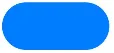 |
ButtonType.Circle |
圓形 |  |
| ) | ||
ButtonType.Normal |
普通形狀 |  |
- options.stateEffect
options.stateEffect表示是否開啟點擊效果,點擊效果如下

1.2.2 包含子組件
子組件會作為按鈕上顯示的內(nèi)容,可以是圖片、文字等。這種方式下,Button組件就不在需要label參數(shù)了,具體如下
Button(options?: {type?: ButtonType, stateEffect?: boolean})
示例代碼:
拷貝icon_new_folder.png到resources/base/media目錄下
在component目錄下新建button目錄,新建ButtonParameter.ets文件
@Entry
@Component
// Button按鈕參數(shù)
struct ButtonParameter {

  build() {
    Column({ space: 50 }) {

      //1、不包含子組件
      Button('按鈕', { type: ButtonType.Capsule, stateEffect: false })
        .fontSize(25)
        .width(150)
        .height(60)

      //2、包含子組件
      Button({ type: ButtonType.Capsule, stateEffect: true }) {
        Row({ space: 5 }) {
          Image($r('app.media.icon_new_folder'))
            .width(30)
            .height(30)
          Text('新建')
            .fontColor(Color.White)
            .fontSize(25)
            .fontWeight(500)
        }
      }.height(60)
      .width(150)

    }.width('100%')
    .height('100%')
    .justifyContent(FlexAlign.Center)
  }
}
1.3 常用屬性
1.3.1 背景顏色
按鈕的顏色可使用backgroundColor()方法進行設(shè)置,例如
Button('綠色按鈕').backgroundColor(Color.Green)
1.3.2 邊框圓角
按鈕的邊框圓角大小可使用borderRadius()方法進行設(shè)置,例如
Button('圓角按鈕', { type: ButtonType.Normal }).borderRadius(10)
示例代碼:
button目錄下新建ButtonAttributePage.ets文件
@Entry
@Component
// Button按鈕屬性
struct ButtonAttributePage {

  build() {
    Row() {
      // 1、背景顏色 backgroundColor
      Column({ space: 50 }) {
        Button('綠色按鈕')
          .fontSize(25)
          .width(150)
          .height(60)
          .backgroundColor(Color.Green)

        // 2、邊框圓角 borderRadius
        Button('圓角按鈕', { type: ButtonType.Normal })
          .fontSize(25)
          .width(150)
          .height(60)
          .borderRadius(20)

      }.width('100%')
      .height('100%')
      .justifyContent(FlexAlign.Center)
    }
  }
}
1.4 常用事件
對于Button組件而言,最為常用的就是點擊事件,可以通過onClick()方法為按鈕綁定點擊事件,該方法的參數(shù)為一個回調(diào)函數(shù),當(dāng)按鈕被點擊時,就會觸發(fā)該回調(diào)函數(shù),例如
Button('點擊事件').onClick(() => {
  console.log('我被點擊了')
})
示例代碼:
在button目錄下新建ButtonEventPage.ets文件
@Entry
@Component
// Button按鈕事件
struct ButtonEventPage {

  build() {
    Row() {
      // 1、點擊事件
      Column({ space: 50 }) {
        Button('點擊事件')
          .fontSize(25)
          .width(150)
          .height(60)
          .onClick(() => {
            console.log('我被點擊了')
          })


      }.width('100%')
      .height('100%')
      .justifyContent(FlexAlign.Center)
    }
  }
}
二、切換按鈕Toggle
2.1 概述
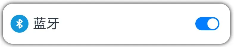
Toggle為切換按鈕組件,一般用于兩種狀態(tài)之間的切換,例如下圖中的藍牙開關(guān)。
2.2 參數(shù)
Toggle組件的參數(shù)定義如下
Toggle(options: { type: ToggleType, isOn?: boolean })
- type
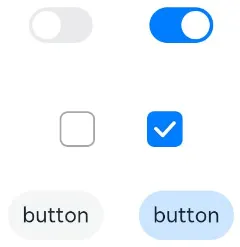
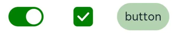
type屬性用于設(shè)置Toggle組件的類型,可通過ToggleType枚舉類型進行設(shè)置,可選的枚舉值如下
| 名稱 | 描述 | 效果 |
|---|---|---|
ToggleType.Switch |
開關(guān) |  |
ToggleType.Checkbox |
復(fù)選框 |  |
ToggleType.Button |
按鈕 |  |
|
- isOn
isOn屬性用于設(shè)置Toggle組件的狀態(tài),例如
示例代碼
在component目錄下新建toggle目錄,新建ToggleParameter.ets 文件
@Entry
@Component
// 切換按鈕Toggle參數(shù)
struct ToggleParameter {

  build() {
    // type參數(shù)設(shè)置類型;ToggleType值:開關(guān)ToggleType.Switch 復(fù)選框ToggleType.Checkbox 按鈕ToggleType.Button
    // isON設(shè)置組件狀態(tài)
    Column({ space: 20 }) {
      Row({ space: 20 }) {
        Toggle({ type: ToggleType.Switch, isOn: false })
        Toggle({ type: ToggleType.Switch, isOn: true })
      }

      Row({ space: 20 }) {
        Toggle({ type: ToggleType.Checkbox, isOn: false })
        Toggle({ type: ToggleType.Checkbox, isOn: true })
      }

      Row({ space: 20 }) {
        Toggle({ type: ToggleType.Button, isOn: false }) {
          Text('button')
        }
        Toggle({ type: ToggleType.Button, isOn: true }) {
          Text('button')
        }
      }
    }.width('100%')
    .height('100%')
    .justifyContent(FlexAlign.Center)
  }
}
2.3 常用屬性
2.3.1 選中狀態(tài)背景色
可使用selectedColor()方法設(shè)置Toggle組件在選中(或打開)狀態(tài)下的背景色,例如
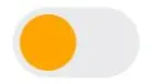
2.3.2 Switch滑塊顏色
可使用設(shè)置switchPointColor()方法設(shè)置Switch類型的Toggle組件中的圓形滑塊顏色,例如
示例代碼:
在toggle目錄下新建ToggleAttributePage.ets文件
@Entry
@Component
// 切換按鈕Toggle常用屬性
struct ToggleAttributePage {

  build() {
    Row() {
      Column({ space: 50 }) {

        //1.選中狀態(tài)背景色 selectedColor
        Row({ space: 20 }) {
          Toggle({ type: ToggleType.Switch, isOn: true })
            .selectedColor(Color.Green)
          Toggle({ type: ToggleType.Checkbox, isOn: true })
            .selectedColor(Color.Green)
          Toggle({ type: ToggleType.Button, isOn: true }) {
            Text('button')
          }.selectedColor('#66008000')

        }

        //2.Switch圓形滑塊顏色 switchPointColor
        Toggle({ type: ToggleType.Switch, isOn: true })
          .selectedColor(Color.Green)
          .switchPointColor(Color.Orange)

      }.width('100%')
      .height('100%')
      .justifyContent(FlexAlign.Center)
    }
  }
}
2.4 常用事件
Toggle組件常用的事件為change事件,每當(dāng)Toggle組件的狀態(tài)發(fā)生變化,就會觸發(fā)change事件。開發(fā)者可通過onChange()方法為Toggle組件綁定change事件,該方法參數(shù)為一個回調(diào)函數(shù),具體定義如下
onChange(callback: (isOn: boolean) => void)
當(dāng)Toggle組件的狀態(tài)由關(guān)閉切換為打開時,isOn為true,從打開切換為關(guān)閉時,isOn為false。
示例代碼:
拷貝素材到resources/base/media目錄下,img_light.png、img_dark.png
在toggle目錄下新建LightPage.ets
@Entry
@Component
struct LightPage {
  @State isOn: boolean = false;

  build() {
    Column({ space: 20 }) {
      if (this.isOn) {
        Image($r('app.media.img_light'))
          .height(300)
          .width(300)
          .borderRadius(20)
      } else {
        Image($r('app.media.img_dark'))
          .height(300)
          .width(300)
          .borderRadius(20)
      }
      Toggle({ type: ToggleType.Switch, isOn: this.isOn })
        .width(60)
        .height(30)
        .onChange((isOn) => {
          this.isOn = isOn;
        })
    }
    .height('100%')
    .width('100%')
    .justifyContent(FlexAlign.Center)
  }
}
《鴻蒙應(yīng)用開發(fā)從入門到項目實戰(zhàn)》系列文章持續(xù)更新中,陸續(xù)更新AI+編程、企業(yè)級項目實戰(zhàn)等原創(chuàng)內(nèi)容,防止迷路,歡迎關(guān)注!
作者:黑馬騰云
微信公眾賬號:自學(xué)幫
博客園:黑馬騰云博客
如果你想及時得到個人撰寫文章以及著作的消息推送,或者想看看個人推薦的技術(shù)資料,可以掃描左邊二維碼(或者長按識別二維碼)關(guān)注微信公眾號)。
本文版權(quán)歸作者和博客園共有,歡迎轉(zhuǎn)載,但未經(jīng)作者同意必須保留此段聲明,且在文章頁面明顯位置給出原文連接,否則保留追究法律責(zé)任的權(quán)利。

 浙公網(wǎng)安備 33010602011771號