
WPF開發中實現DataGrid中的數據分頁顯示,自定義分頁樣式(與上一篇不同的分頁)
實際開發中,我們可能需要自己寫一些自定義的分頁設計,所以我們需要學會自己封裝一個可以直接套用的分頁控件,以下就是一個完整的用例,話不多說,我們直接上代碼實現。
1.新建一個分頁控件View:Pagination2Control
1.1 UI展示如下
<UserControl x:Class="WPFDemoMVVM.Controls.Pagination2Control"
			 xmlns="http://schemas.microsoft.com/winfx/2006/xaml/presentation"
			 xmlns:x="http://schemas.microsoft.com/winfx/2006/xaml"
			 xmlns:mc="http://schemas.openxmlformats.org/markup-compatibility/2006"
			 xmlns:d="http://schemas.microsoft.com/expression/blend/2008"
			 xmlns:local="clr-namespace:WPFDemoMVVM.Controls"
			 xmlns:lang="clr-namespace:WPFDemoMVVM.Resources"
			 xmlns:lex="http://wpflocalizeextension.codeplex.com"
			 lex:ResxLocalizationProvider.DefaultAssembly="WPFDemoMVVM"
			 lex:ResxLocalizationProvider.DefaultDictionary="Lang"
			 lex:LocalizeDictionary.DesignCulture="zh-CN"
			 mc:Ignorable="d"
			 d:DesignHeight="30" d:DesignWidth="800">
	<UserControl.Resources>
		<Style x:Key="PgBaseButtonStyle" TargetType="Button" >
			<Setter Property="Template">
				<Setter.Value>
					<ControlTemplate TargetType="Button">
						<Border CornerRadius="6"
						 Background="{TemplateBinding Background}"
						 BorderBrush="{TemplateBinding BorderBrush}"
						 BorderThickness="{TemplateBinding BorderThickness}">
							<Grid>
								<ContentPresenter HorizontalAlignment="Center"
						   VerticalAlignment="Center"
						   Content="{TemplateBinding Content}"/>
							</Grid>
						</Border>
					</ControlTemplate>
				</Setter.Value>
			</Setter>
			<Setter Property="Background" Value="#282B3B"/>
			<Setter Property="BorderBrush" Value="#367AFF"/>
			<Setter Property="BorderThickness" Value="1"/>
			<Setter Property="Foreground" Value="White"/>
			<Setter Property="Padding" Value="0"/>
			<Setter Property="Height" Value="30"/>
			<Setter Property="Width" Value="70"/>
			<Setter Property="FontSize" Value="14"/>
			<Setter Property="VerticalAlignment" Value="Center"/>
			<Setter Property="VerticalContentAlignment" Value="Center"/>
			<Setter Property="HorizontalAlignment" Value="Center"/>
			<Setter Property="HorizontalContentAlignment" Value="Center"/>
			<Setter Property="Margin" Value="5 0"/>
			<Style.Triggers>
				<Trigger Property="IsMouseOver" Value="True">
					<Setter Property="Foreground" Value="White"/>
					<Setter Property="BorderThickness" Value="2"/>
					<Setter Property="Cursor" Value="Hand"/>
					<Setter Property="Opacity" Value="1"/>
				</Trigger>
			</Style.Triggers>
		</Style>

		<Style x:Key="PgComBoxStyle" TargetType="ComboBox">
			<Setter Property="Background" Value="#0D0D19"/>
			<Setter Property="FontSize" Value="14"/>
			<Setter Property="Margin" Value="20,0,0,0"/>
			<Setter Property="Height" Value="32"/>
			<Setter Property="Width" Value="80"/>
			<Setter Property="VerticalAlignment" Value="Center"/>
			<Setter Property="HorizontalAlignment" Value="Center"/>
			<Setter Property="BorderBrush" Value="#367AFF"/>
			<Setter Property="BorderThickness" Value="0"/>
			<Setter Property="FontFamily" Value="Arial"/>
		</Style>


		<Style TargetType="TextBlock" x:Key="BaseTextBlockStyle">
			<Setter Property="FontSize" Value="14"/>
			<Setter Property="FontFamily" Value="Arial"/>
			<Setter Property="FontWeight" Value="Normal"/>
			<Setter Property="Opacity" Value="1"/>
			<Setter Property="Background" Value="{x:Null}"/>
			<Setter Property="Foreground" Value="White"/>
			<Setter Property="VerticalAlignment" Value="Center"/>
			<Setter Property="HorizontalAlignment" Value="Center"/>
			<Setter Property="Padding" Value="0"/>
		</Style>

		<Style x:Key="BaseComboBoxStyle" TargetType="ComboBox">
			<Setter Property="Foreground" Value="White"/>
			<Setter Property="Background" Value="#0D0D19"/>
			<Setter Property="BorderThickness" Value="0"/>
			<Setter Property="FontSize" Value="14"/>
			<Setter Property="FontFamily" Value="Arial"/>
			<Setter Property="Width" Value="80"/>
			<Setter Property="Height" Value="32"/>
			<Setter Property="FontSize" Value="14"/>
			<Setter Property="HorizontalAlignment" Value="Right"/>
			<Setter Property="VerticalAlignment" Value="Center"/>
			<Setter Property="Margin" Value="5,0,5,0"/>
			<Setter Property="IsEditable" Value="False"/>
			<Setter Property="ItemTemplate">
				<Setter.Value>
					<DataTemplate>
						<TextBlock Text="{Binding}" Style="{StaticResource BaseTextBlockStyle}" HorizontalAlignment="Center"/>
					</DataTemplate>
				</Setter.Value>
			</Setter>
			<Setter Property="Template">
				<Setter.Value>
					<ControlTemplate TargetType="ComboBox">
						<Grid>
							<ToggleButton
								Name="ToggleButton"
								IsChecked="{Binding Path=IsDropDownOpen, Mode=TwoWay, RelativeSource={RelativeSource TemplatedParent}}"
								ClickMode="Press"
								Background="{TemplateBinding Background}"
								BorderThickness="{TemplateBinding BorderThickness}" Width="{TemplateBinding Width}">
								<Grid>
									<ContentPresenter
									Name="ContentSite"
									IsHitTestVisible="False"
									Content="{TemplateBinding SelectionBoxItem}"
									ContentTemplate="{TemplateBinding SelectionBoxItemTemplate}"
									VerticalAlignment="Center"
									HorizontalAlignment="Left" Width="60"
									Margin="5,0,0,0"
									RecognizesAccessKey="True"/>
									<Path
									HorizontalAlignment="Right"
									Margin="0,0,6,0"
									VerticalAlignment="Center"
									Data="M 0 0 L 4 4 L 8 0 Z"
									Fill="White"/>
								</Grid>
							</ToggleButton>
							<Popup
							Name="Popup"
							Placement="Bottom"
							IsOpen="{TemplateBinding IsDropDownOpen}"
							AllowsTransparency="True"
							Focusable="False"
							PopupAnimation="Slide">
								<Grid
								Name="DropDown"
								SnapsToDevicePixels="True"
								MinWidth="{TemplateBinding ActualWidth}"
								MaxHeight="200"
								Background="#0D0D19">
									<Border x:Name="DropDownBorder" BorderThickness="0" Background="#0D0D19"/>
									<ScrollViewer Margin="4,6,4,6" SnapsToDevicePixels="True">
										<StackPanel IsItemsHost="True" KeyboardNavigation.DirectionalNavigation="Contained" />
									</ScrollViewer>
								</Grid>
							</Popup>
						</Grid>
						<ControlTemplate.Triggers>
							<Trigger Property="HasItems" Value="false">
								<Setter TargetName="DropDownBorder" Property="MinHeight" Value="95"/>
							</Trigger>
							<Trigger Property="IsEnabled" Value="false">
								<Setter Property="Foreground" Value="Gray"/>
							</Trigger>
							<Trigger Property="IsMouseOver" Value="True">
								<Setter Property="Background" Value="#1A1A2A"/>
							</Trigger>
						</ControlTemplate.Triggers>
					</ControlTemplate>
				</Setter.Value>
			</Setter>
		</Style>

		<Style TargetType="TextBox" x:Key="BaseTextBoxStyle">
			<Setter Property="Height" Value="32"/>
			<Setter Property="Width" Value="98"/>
			<Setter Property="FontSize" Value="14"/>
			<Setter Property="FontFamily" Value="Arial"/>
			<Setter Property="FontWeight" Value="Normal"/>
			<Setter Property="Opacity" Value="0.8"/>
			<Setter Property="Background" Value="#0C0E1A"/>
			<Setter Property="Foreground" Value="White"/>
			<Setter Property="BorderThickness" Value="0"/>
			<Setter Property="Padding" Value="0"/>
			<Setter Property="VerticalAlignment" Value="Center"/>
			<Setter Property="HorizontalAlignment" Value="Center"/>
			<Setter Property="VerticalContentAlignment" Value="Center"/>
			<Setter Property="HorizontalContentAlignment" Value="Left"/>
			<!-- 設置光標顏色為白色 -->
			<Setter Property="CaretBrush" Value="White"/>
		</Style>

	</UserControl.Resources>

	<StackPanel Orientation="Horizontal" VerticalAlignment="Center" HorizontalAlignment="Center" >
		<Button Content="?" Command="{Binding PreviousPageCommand}" IsEnabled="{Binding CanGoPrevious}" Style="{DynamicResource PgBaseButtonStyle}" Width="30"/>

		<!-- 頁碼顯示為橫向排列 -->
		<ItemsControl ItemsSource="{Binding PageNumbers}">
			<ItemsControl.ItemsPanel>
				<ItemsPanelTemplate>
					<StackPanel Orientation="Horizontal" HorizontalAlignment="Center" />
				</ItemsPanelTemplate>
			</ItemsControl.ItemsPanel>
			<ItemsControl.ItemTemplate>
				<DataTemplate>
					<Button Content="{Binding Display}"
					Margin="2"
					Padding="5,2"
					MinWidth="30"
					IsEnabled="{Binding IsEnabled}"
					Command="{Binding DataContext.GoToPageCommand, RelativeSource={RelativeSource AncestorType=UserControl}}"
					CommandParameter="{Binding PageNumber}" Style="{DynamicResource PgBaseButtonStyle}" Width="30"/>
				</DataTemplate>
			</ItemsControl.ItemTemplate>
		</ItemsControl>

		<Button Content="?" Command="{Binding NextPageCommand}" IsEnabled="{Binding CanGoNext}" Style="{DynamicResource PgBaseButtonStyle}" Width="30"/>

		<TextBlock Text="{lex:Loc PageSize}" VerticalAlignment="Center" Style="{DynamicResource ResourceKey=BaseTextBlockStyle}" FontSize="14" Margin="5 0"/>
		<ComboBox ItemsSource="{Binding PageSizeOptions, Mode=OneWay}" SelectedItem="{Binding ItemsPerPage,  Mode=TwoWay}" Style="{DynamicResource BaseComboBoxStyle}" Margin="5 0"/>

		<!-- 總記錄數和頁數 -->
		<TextBlock VerticalAlignment="Center" Margin="10,0,0,0" Text="{Binding SummaryText}" Style="{DynamicResource BaseTextBlockStyle}"/>
	</StackPanel>
</UserControl>
1.2 分頁控件的ViewModel:Paging2ViewModel
public partial class Paging2ViewModel : ObservableObject
{
	private int _totalItems;
	private int _itemsPerPage = 10;
	private int _currentPage = 1;
	private int _maxVisiblePages = 7;

	[ObservableProperty]
	private ObservableCollection<int> pageSizeOptions;

	//[ObservableProperty]
	//private int pageSize;

	[ObservableProperty]
	private string language;

	public int TotalItems
	{
		get => _totalItems;
		set
		{
			SetProperty(ref _totalItems, value);
			UpdatePagination();
		}
	}

	public int ItemsPerPage
	{
		get => _itemsPerPage;
		set
		{
			SetProperty(ref _itemsPerPage, value);
			UpdatePagination();
		}
	}

	public int CurrentPage
	{
		get => _currentPage;
		set
		{
			SetProperty(ref _currentPage, value);
			UpdatePagination();
		}
	}

	public ObservableCollection<PaginationPageNumber> PageNumbers { get; set; } = new();

	public ICommand NextPageCommand => new RelayCommand(() =>
	{
		if (CurrentPage < TotalPages)
			CurrentPage++;
		PageChanged.Invoke(CurrentPage, ItemsPerPage);
	});

	public ICommand PreviousPageCommand => new RelayCommand(() =>
	{
		if (CurrentPage > 1)
			CurrentPage--;
		PageChanged.Invoke(CurrentPage, ItemsPerPage);
	});

	public ICommand GoToPageCommand => new RelayCommand<int>(page =>
	{
		if (page != CurrentPage)
			CurrentPage = page;
		PageChanged.Invoke(CurrentPage, ItemsPerPage);
	});

	public ICommand CurrentPageChangedCommand { get; set; }

	public int TotalPages => (int)Math.Ceiling((double)TotalItems / ItemsPerPage);

	public bool CanGoNext => CurrentPage < TotalPages;
	public bool CanGoPrevious => CurrentPage > 1;

	public string SummaryText => Language == "zh-CN" ? $"共 {TotalItems} 條 / {TotalPages} 頁" : $"total {TotalItems} items / {TotalPages} pages";

	public Paging2ViewModel()
	{
		Language = "zh-CN";
		PageSizeOptions = new ObservableCollection<int> { 10, 20, 50 };
		ItemsPerPage = PageSizeOptions[0];
		CurrentPage = 1;
		UpdatePagination();
	}

	private void UpdatePagination()
	{
		PageNumbers.Clear();
		int totalPages = TotalPages;

		if (totalPages <= _maxVisiblePages)
		{
			for (int i = 1; i <= totalPages; i++)
				AddPageButton(i);
		}
		else
		{
			AddPageButton(1);

			if (CurrentPage > 4)
				AddEllipsis();

			int start = Math.Max(2, CurrentPage - 1);
			int end = Math.Min(totalPages - 1, CurrentPage + 1);

			for (int i = start; i <= end; i++)
				AddPageButton(i);

			if (CurrentPage < totalPages - 3)
				AddEllipsis();

			AddPageButton(totalPages);
		}

		CurrentPageChangedCommand?.Execute(CurrentPage);
		OnPropertyChanged(nameof(SummaryText));
		OnPropertyChanged(nameof(CanGoNext));
		OnPropertyChanged(nameof(CanGoPrevious));
	}

	private void AddPageButton(int number)
	{
		PageNumbers.Add(new PaginationPageNumber
		{
			Display = number.ToString(),
			PageNumber = number,
			IsEnabled = number != CurrentPage
		});
	}

	private void AddEllipsis()
	{
		PageNumbers.Add(new PaginationPageNumber
		{
			Display = "...",
			PageNumber = -1,
			IsEnabled = false
		});
	}

	//partial void OnPageSizeChanged(int value)
	//{
	//    CurrentPage = 1;
	//    OnPropertyChanged(nameof(TotalPages));
	//    OnPropertyChanged(nameof(SummaryText));
	//    //GoToPageCommand(CurrentPage);
	//    UpdatePagination();
	//}


	partial void OnLanguageChanged(string value)
	{
		OnPropertyChanged(nameof(SummaryText));
	}

	public event Action<int, int> PageChanged;
}

public class PaginationPageNumber
{
	public string Display { get; set; } // "1", "...", "5" 等
	public int PageNumber { get; set; }
	public bool IsEnabled { get; set; } = true;
}
2.DataGridAndPageView 界面展示如下:
2.1 UI界面如下:
<Window x:Class="WPFDemoMVVM.View.DataGridAndPageView"
		 xmlns="http://schemas.microsoft.com/winfx/2006/xaml/presentation"
		 xmlns:x="http://schemas.microsoft.com/winfx/2006/xaml"
		 xmlns:d="http://schemas.microsoft.com/expression/blend/2008"
		 xmlns:mc="http://schemas.openxmlformats.org/markup-compatibility/2006"
		 xmlns:local="clr-namespace:WPFDemoMVVM.View"
		 xmlns:hr="clr-namespace:WPFDemoMVVM.Helpers"
		 xmlns:be="clr-namespace:WPFDemoMVVM.Behaviors"
		 xmlns:i="http://schemas.microsoft.com/xaml/behaviors"
		 xmlns:pg="clr-namespace:WPFDemoMVVM.Controls"
		 xmlns:lang="clr-namespace:WPFDemoMVVM.Resources"
		 xmlns:lex="http://wpflocalizeextension.codeplex.com"
		 lex:ResxLocalizationProvider.DefaultAssembly="WPFDemoMVVM"
		 lex:ResxLocalizationProvider.DefaultDictionary="Lang"
		 lex:LocalizeDictionary.DesignCulture="zh-CN"
		 mc:Ignorable="d"
		 WindowStartupLocation="CenterScreen"
		 Style="{DynamicResource WindowBaseCommonStyle}"
		 Height="600" Width="800">

	<!--穿透屬性,使窗口背景透明-->
	<WindowChrome.WindowChrome>
		<WindowChrome CaptionHeight="50"/>
	</WindowChrome.WindowChrome>

	<Window.Resources>
		<CollectionViewSource x:Key="view" Filter="CollectionViewSource_Filter"/>


		<!--datagrid樣式-->
		<Style x:Key="DataGridStyleCommon" TargetType="DataGrid">
			<Setter Property="RowHeight" Value="40"/>
			<Setter Property="Background"  Value="#191D2A" />
			<Setter Property="BorderBrush"  Value="{x:Null}" />
			<Setter Property="Foreground" Value="White"/>
			<Setter Property="Opacity" Value="1"/>
			<!--該屬性指示是否允許用戶調整列寬度-->
			<Setter Property="CanUserResizeColumns"   Value="false" />
			<!--網格線顏色-->
			<Setter Property="VerticalGridLinesBrush" Value="{x:Null}"/>
			<Setter Property="IsReadOnly" Value="True"></Setter>
			<Setter Property="HorizontalGridLinesBrush">
				<Setter.Value>
					<SolidColorBrush Color="#10FFFFFF" />
					<!--網格透明度-->
				</Setter.Value>
			</Setter>
			<!--<Setter Property="VerticalGridLinesBrush">
		 <Setter.Value>
			 <SolidColorBrush Color="#FFEA8777" />
		 </Setter.Value>
	 </Setter>-->
			<!--表格字段顯示手動完成-->
			<Setter Property="AutoGenerateColumns" Value="False"></Setter>
			<!--隔行換色 -->
			<Setter Property="AlternationCount" Value="3"></Setter>
			<!--DataGrid控件模板-->
			<Setter Property="Template">
				<Setter.Value>
					<ControlTemplate TargetType="{x:Type DataGrid}">
						<Border BorderBrush="{TemplateBinding BorderBrush}" BorderThickness="{TemplateBinding BorderThickness}" x:Name="border"
						 Background="{TemplateBinding Background}" Padding="{TemplateBinding Padding}" SnapsToDevicePixels="True">
							<ScrollViewer x:Name="DG_ScrollViewer" Focusable="false">
								<ScrollViewer.Template>
									<ControlTemplate TargetType="{x:Type ScrollViewer}">
										<Grid>
											<Grid.ColumnDefinitions>
												<ColumnDefinition x:Name="col_rowheader" Width="1" />
												<ColumnDefinition Width="*" />
												<ColumnDefinition Width="Auto" />
											</Grid.ColumnDefinitions>
											<Grid.RowDefinitions>
												<RowDefinition Height="Auto" />
												<RowDefinition Height="*" />
												<RowDefinition Height="Auto" />
											</Grid.RowDefinitions>
											<!--選中所有行-->
											<Button Command="ApplicationCommands.SelectAll" Focusable="False" Style="{DynamicResource {ComponentResourceKey ResourceId=DataGridSelectAllButtonStyle, TypeInTargetAssembly={x:Type DataGrid}}}" Width="{Binding CellsPanelHorizontalOffset, RelativeSource={RelativeSource FindAncestor, AncestorLevel=1, AncestorType={x:Type DataGrid}}}">
												<Button.Visibility>
													<Binding Path="HeadersVisibility" RelativeSource="{RelativeSource FindAncestor, AncestorLevel=1, AncestorType={x:Type DataGrid}}">
														<Binding.ConverterParameter>
															<DataGridHeadersVisibility>All</DataGridHeadersVisibility>
														</Binding.ConverterParameter>
													</Binding>
												</Button.Visibility>
											</Button>
											<!--表格頭部-->
											<DataGridColumnHeadersPresenter x:Name="PART_ColumnHeadersPresenter" Grid.Column="1" Grid.ColumnSpan="2"
												 Visibility="{Binding HeadersVisibility, ConverterParameter={x:Static DataGridHeadersVisibility.Column}, Converter={x:Static DataGrid.HeadersVisibilityConverter}, RelativeSource={RelativeSource AncestorType={x:Type DataGrid}}}" >
											</DataGridColumnHeadersPresenter>
											<!--主數據區-->
											<Grid Grid.Row="1" Grid.ColumnSpan="2">
												<ScrollContentPresenter x:Name="PART_ScrollContentPresenter" CanContentScroll="{TemplateBinding CanContentScroll}" Grid.ColumnSpan="2" />
											</Grid>
											<!--垂直滑動條-->

											<ScrollBar x:Name="PART_VerticalScrollBar" Grid.Column="2" Maximum="{TemplateBinding ScrollableHeight}"
												Orientation="Vertical" Grid.Row="0" Grid.RowSpan="3" Visibility="{TemplateBinding ComputedVerticalScrollBarVisibility}"
												Value="{Binding VerticalOffset, Mode=OneWay, RelativeSource={RelativeSource TemplatedParent}}"
												ViewportSize="{TemplateBinding ViewportHeight}" />

											<!--橫向滑動條-->
											<!--
									 <ScrollBar x:Name="PART_HorizontalScrollBar" Grid.Column="0" Grid.ColumnSpan="2" Grid.Row="2"
													Maximum="{TemplateBinding ScrollableWidth}" Orientation="Horizontal"
													Visibility="{TemplateBinding ComputedHorizontalScrollBarVisibility}"
													Value="{Binding HorizontalOffset, Mode=OneWay, RelativeSource={RelativeSource TemplatedParent}}"
													ViewportSize="{TemplateBinding ViewportWidth}" />-->
										</Grid>
									</ControlTemplate>
								</ScrollViewer.Template>
								<ItemsPresenter SnapsToDevicePixels="{TemplateBinding SnapsToDevicePixels}" />
							</ScrollViewer>
						</Border>
						<ControlTemplate.Triggers>
							<Trigger Property="IsEnabled" Value="false">
								<Setter Property="Opacity" Value="1" TargetName="border" />
							</Trigger>
						</ControlTemplate.Triggers>
					</ControlTemplate>
				</Setter.Value>
			</Setter>
			<Style.Triggers>
				<Trigger Property="IsGrouping" Value="true">
					<Setter Property="ScrollViewer.CanContentScroll" Value="false" />
				</Trigger>
			</Style.Triggers>

		</Style>

		<!--行頭部樣式-->
		<Style x:Key="DataGridRowHeaderStyleCommon" TargetType="DataGridRowHeader">
			<Setter Property="HorizontalContentAlignment" Value="Stretch" />
			<Setter Property="VerticalContentAlignment" Value="Center" />
			<Setter Property="Background" Value="Transparent" />
			<Setter Property="BorderBrush" Value="{x:Null}" />
			<Setter Property="BorderThickness" Value="1" />
			<Setter Property="Margin" Value="0,0,0,0" />
			<Setter Property="Template">
				<Setter.Value>
					<ControlTemplate TargetType="{x:Type DataGridRowHeader}">
						<Grid>
							<Border BorderBrush="{TemplateBinding BorderBrush}"
							Background="{TemplateBinding Background}"
							BorderThickness="{TemplateBinding BorderThickness}"
							Padding="{TemplateBinding Padding}"
							Margin="{TemplateBinding Margin}"
							SnapsToDevicePixels="True">
								<ContentPresenter SnapsToDevicePixels="{TemplateBinding SnapsToDevicePixels}"
										  VerticalAlignment="{TemplateBinding VerticalContentAlignment}"
										  HorizontalAlignment="{TemplateBinding HorizontalContentAlignment}"/>
							</Border>
						</Grid>
					</ControlTemplate>
				</Setter.Value>
			</Setter>
		</Style>

		<!--標題欄 列頭部樣式-->
		<Style x:Key="DataGridColumnHeaderStyleCommon" TargetType="DataGridColumnHeader">
			<Setter Property="SnapsToDevicePixels" Value="True" />
			<Setter Property="MinWidth" Value="15" />
			<Setter Property="MinHeight" Value="28" />
			<!--<Setter Property="Foreground" Value="#FF0FA459" />-->
			<Setter Property="Foreground" Value="{DynamicResource textBoxWhiteColor}" />
			<Setter Property="FontSize"   Value="14" />
			<!--<Setter Property="Cursor"     Value="Hand" />-->
			<Setter Property="Height" Value="30" />
			<Setter Property="Template">
				<Setter.Value>
					<ControlTemplate TargetType="DataGridColumnHeader">
						<!--設置表頭的背景等樣式-->
						<Border x:Name="BackgroundBorder"  Background="{DynamicResource backgroundGrayColor}"   BorderThickness="0"   BorderBrush="{DynamicResource borderBrushCommonColor}"  Width="Auto">
							<Grid>
								<Grid.ColumnDefinitions>
									<ColumnDefinition Width="*" />
								</Grid.ColumnDefinitions>
								<!--內容-->
								<ContentPresenter  Margin="0,0,0,0"  VerticalAlignment="Center"  HorizontalAlignment="Center" />
								<!--排序圖標-->
								<Path x:Name="SortArrow"  Visibility="Collapsed"   Data="M0,0 L1,0 0.5,1 z"  Stretch="Fill"    Grid.Column="2"
								   Width="8"  Height="6"  Fill="{DynamicResource textBoxWhiteColor}" Margin="0,0,50,0"  VerticalAlignment="Center"  RenderTransformOrigin="1,1" />
								<!--分割線-->
								<Rectangle Visibility="Collapsed"  Width="1" Fill="#d6c79b" HorizontalAlignment="Right"  Grid.ColumnSpan="1"   />
							</Grid>
						</Border>
					</ControlTemplate>
				</Setter.Value>
			</Setter>
		</Style>


		<!--行樣式觸發-->
		<!--背景色改變必須先設置cellStyle 因為cellStyle會覆蓋rowStyle樣式-->
		<Style x:Key="DataGridRowStyleCommon"  TargetType="DataGridRow">
			<Setter Property="Background"  Value="#0D0D19"/>
			<Setter Property="Height"  Value="40" />
			<Setter Property="Foreground" Value="White" />
			<Style.Triggers>
				<!--隔行換色-->
				<!--<Trigger Property="AlternationIndex"  Value="0">
			<Setter Property="Background"   Value="{x:Null}" />
		</Trigger>-->
				<!--<Trigger Property="AlternationIndex"   Value="1">
			<Setter Property="Background" Value="#FFD4C9F9" />
		</Trigger>
		<Trigger Property="AlternationIndex"   Value="2">
			<Setter Property="Background" Value="#FFFFCFC7" />
		</Trigger>-->
				<Trigger Property="IsMouseOver"   Value="True">
					<Setter Property="Foreground" Value="White"/>
					<Setter Property="Background"  Value="#191D2A" />
					<Setter Property="Cursor" Value="Hand"/>
					<Setter Property="Opacity" Value="0.6"></Setter>
				</Trigger>
				<Trigger Property="IsSelected" Value="True">
					<!--<Setter Property="Foreground"   Value="#FFF31006" />-->
					<Setter Property="Opacity" Value="1"></Setter>
					<Setter Property="Background" Value="#1D1D2A"/>
				</Trigger>
			</Style.Triggers>
		</Style>

		<!--單元格樣式觸發-->
		<Style x:Key="DataGridCellStyleCommon" TargetType="DataGridCell">
			<Setter Property="Template">
				<Setter.Value>
					<ControlTemplate TargetType="DataGridCell">
						<TextBlock TextAlignment="Center"  VerticalAlignment="Center">
					<ContentPresenter />
						</TextBlock>
					</ControlTemplate>
				</Setter.Value>
			</Setter>
			<Style.Triggers>
				<Trigger Property="IsSelected" Value="True">
					<Setter Property="Foreground" Value="White" />
					<Setter Property="FontWeight" Value="Bold"/>
				</Trigger>
				<Trigger Property="IsMouseOver" Value="True">
					<Setter Property="Foreground" Value="White"/>
				</Trigger>
			</Style.Triggers>
		</Style>


	</Window.Resources>
	<Grid>
		<Grid.RowDefinitions>
			<RowDefinition Height="30"/>
			<RowDefinition/>
			<RowDefinition Height="40"/>
			<RowDefinition Height="80"/>
		</Grid.RowDefinitions>

		<StackPanel Grid.Row="0" VerticalAlignment="Center" Orientation="Horizontal" HorizontalAlignment="Right" Margin="5">
			<Button Content="{lex:Loc Close}" Command="{Binding CloseCommand}" Style="{DynamicResource BtnWindowChangeStyle}"></Button>
		</StackPanel>

		<Grid Grid.Row="1" Height="500" Width="auto">
			<DataGrid Name="userInfoGrid"  AutoGenerateColumns="False" Height="440" HorizontalAlignment="Left" HorizontalContentAlignment="Center" VerticalAlignment="Top" IsReadOnly="True" CanUserAddRows="False" VerticalScrollBarVisibility="Auto" EnableRowVirtualization="False"
				Style="{DynamicResource ResourceKey=DataGridStyleCommon}"
				   RowHeaderStyle="{DynamicResource ResourceKey=DataGridRowHeaderStyleCommon}"
				   ColumnHeaderStyle="{DynamicResource ResourceKey=DataGridColumnHeaderStyleCommon}"
				   RowStyle="{DynamicResource ResourceKey=DataGridRowStyleCommon}"
				   CellStyle="{DynamicResource ResourceKey=DataGridCellStyleCommon}" Margin="2 0 5 0" BorderThickness="1" ItemsSource="{Binding CollectionView,Mode=OneWay}"
						  hr:MultiSelectorHelper.MonitorSelectionChanged="True"
							hr:MultiSelectorHelper.BindableSelectedItems="{Binding SelectedItems,Mode=OneWayToSource}"
						  >

				<i:Interaction.Behaviors>
					<be:SelectedItemsBehavior BindableSelectedItems="{Binding SelectedItems,Mode=OneWayToSource}"/>
				</i:Interaction.Behaviors>
				<DataGrid.Columns>
					<DataGridTextColumn Binding="{Binding Index}" CanUserSort="False" IsReadOnly="True" Width="60">
						<DataGridTextColumn.HeaderTemplate>
							<DataTemplate>
								<TextBlock Text="{lex:Loc Number}"/>
							</DataTemplate>
						</DataGridTextColumn.HeaderTemplate>
					</DataGridTextColumn>
					<DataGridTextColumn Binding="{Binding Name}" CanUserSort="False" IsReadOnly="True" Width="*">
						<DataGridTextColumn.HeaderTemplate>
							<DataTemplate>
								<TextBlock Text="{lex:Loc AccountName}"/>
							</DataTemplate>
						</DataGridTextColumn.HeaderTemplate>
					</DataGridTextColumn>
					<DataGridTextColumn Binding="{Binding Salary}" CanUserSort="False" IsReadOnly="True" Width="*">
						<DataGridTextColumn.HeaderTemplate>
							<DataTemplate>
								<TextBlock Text="{lex:Loc Salary}"/>
							</DataTemplate>
						</DataGridTextColumn.HeaderTemplate>
					</DataGridTextColumn>
				</DataGrid.Columns>
			</DataGrid>
		</Grid>

		<pg:Pagination2Control x:Name="pageControl" Grid.Row="2" DataContext="{Binding Pagination}" VerticalAlignment="Bottom" Background="#191D2A" Height="40">
		</pg:Pagination2Control>
		<StackPanel Grid.Row="3" Orientation="Horizontal">
			<TextBlock Text="{lex:Loc AccountName}" Style="{DynamicResource BaseTextBlockStyle}" Margin="5"/>
			<TextBox x:Name="queryKeyword" Text="{Binding QueryKeyword,UpdateSourceTrigger=PropertyChanged}" Width="200" Height="32" Margin="5"/>
			<Button Margin="5" Content="{lex:Loc Add}" Command="{Binding AddCommand}"/>
			<Button Margin="5" Content="{lex:Loc Delete}" Command="{Binding DeleteCommand}"/>
			<Button Margin="5" Content="{lex:Loc Calculate}" Command="{Binding CalculateSumSalaryCommand}" CommandParameter="{Binding ElementName=userInfoGrid,Path=SelectedItems}"/>
			<TextBox Text="{Binding TotalSalary}" Width="100" Height="32" Margin="5"/>
			<ComboBox  Margin="5" Width="100" ItemsSource="{Binding Languages}" SelectedValuePath="Tag" DisplayMemberPath="Name" SelectedValue="{Binding SelectedLanguage, Mode=TwoWay}" Style="{DynamicResource BaseComboBoxStyle}" >
				<i:Interaction.Triggers>
					<i:EventTrigger EventName="SelectionChanged">
						<i:InvokeCommandAction  Command="{Binding ChangeLanguageCommand}" CommandParameter="{Binding SelectedValue, RelativeSource={RelativeSource AncestorType=ComboBox}}" />
					</i:EventTrigger>
				</i:Interaction.Triggers>
			</ComboBox>
		</StackPanel>

	</Grid>

</Window>
2.2 實現DataGridAndPageViewModel的業務邏輯:
public partial class DataGridAndPageViewModel: ObservableObject
{
	public List<EmployeeModel> employees;

	[ObservableProperty]
	ICollectionView collectionView;

	[ObservableProperty]
	string queryKeyword;

	[ObservableProperty]
	IList selectedItems;

	[ObservableProperty]
	private double totalSalary;

	[ObservableProperty]
	public Paging2ViewModel pagination;

	public ObservableCollection<LanguageItem> Languages { get; } = new ObservableCollection<LanguageItem>
	{
		new LanguageItem { Tag = "zh-CN", Name = "中文" },
		new LanguageItem { Tag = "en", Name = "英文" }
	};

	[ObservableProperty]
	private string selectedLanguage;

	public ICommand CloseCommand { get; }
	public DataGridAndPageViewModel()
	{
		Pagination = new Paging2ViewModel();
		Pagination.PageChanged += OnPageChanged;
		ChangeLanguage("zh-CN");

		IEnumerable<EmployeeModel> employees = EmployeeModel.FakeMany(10);
		this.employees = new List<EmployeeModel>(employees);

		var pageData = this.employees
			.Skip((Pagination.CurrentPage - 1) * Pagination.ItemsPerPage)
			.Take(Pagination.ItemsPerPage)
			.Select((e, i) =>
			{
				e.Index = (Pagination.CurrentPage - 1) * Pagination.ItemsPerPage + i + 1;
				return e;
			}).ToList();

		CollectionView = CollectionViewSource.GetDefaultView(pageData);

		Pagination.TotalItems = this.employees.Count;


		CloseCommand = new RelayCommand(() =>
		{
			// 發送關閉窗口的消息
			WeakReferenceMessenger.Default.Send(new CloseWindowMessage("DataGridAndPageView"));
		});
	}


	partial void OnQueryKeywordChanged(string value)
	{
		Pagination.CurrentPage = 1; // 篩選后回到第一頁
		OnPageChanged(Pagination.CurrentPage, Pagination.ItemsPerPage);
	}

	[RelayCommand]
	private void ChangeLanguage(string languageCode)
	{
		SelectedLanguage = languageCode;
		Pagination.Language = languageCode;
		var culture = new CultureInfo(languageCode);
		Thread.CurrentThread.CurrentCulture = culture;
		Thread.CurrentThread.CurrentUICulture = culture;
		LocalizeDictionary.Instance.Culture = culture;
	}


	private void OnPageChanged(int currentPage, int pageSize)
	{
		var filtered = employees.Where(e => string.IsNullOrEmpty(QueryKeyword) || e.Name.Contains(QueryKeyword, StringComparison.OrdinalIgnoreCase)).ToList();
		Pagination.TotalItems = filtered.Count;

		//重新生成索引 number從1開始
		var pageData = filtered
			.Skip((currentPage - 1) * pageSize)
			.Take(pageSize)
			.Select((e, i) =>
			{
				e.Index = (currentPage - 1) * pageSize + i + 1;
				return e;
			}).ToList();

		CollectionView = CollectionViewSource.GetDefaultView(pageData);

	}


	[RelayCommand]
	public void Add()
	{
		employees.Add(EmployeeModel.FakeOne());
		OnPageChanged(Pagination.CurrentPage, Pagination.ItemsPerPage);
	}

	[RelayCommand]
	public void Delete()
	{
		if (SelectedItems != null)
		{
			employees.RemoveAll(e => SelectedItems.Contains(e));
			OnPageChanged(Pagination.CurrentPage, Pagination.ItemsPerPage);
		}
	}


	[RelayCommand]
	public void CalculateSumSalary()
	{
		if (SelectedItems != null)
		{
			var sum = SelectedItems.Cast<EmployeeModel>().Sum(x => ((EmployeeModel)x).Salary);
			TotalSalary = sum;
		}

		foreach (var item in employees)
		{
			item.IsSelected = item.Salary > 15000;
		}
		collectionView.Refresh();
	}

}
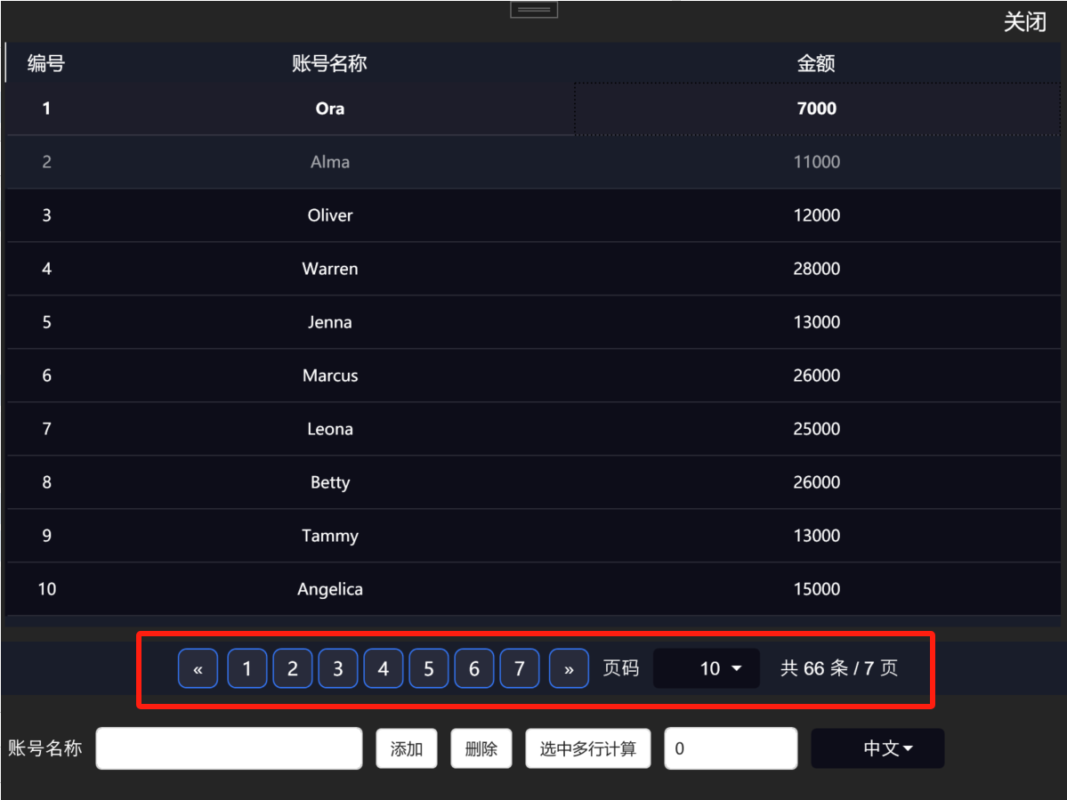
3.運行效果如下:

分頁顯示
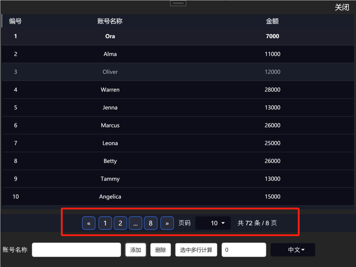
超過7頁后,顯示“....”:
源代碼地址:https://gitee.com/chenshibao/wpfdemo.git
如果本文介紹對你有幫助,可以一鍵四連:點贊+評論+收藏+推薦,謝謝!

 浙公網安備 33010602011771號